


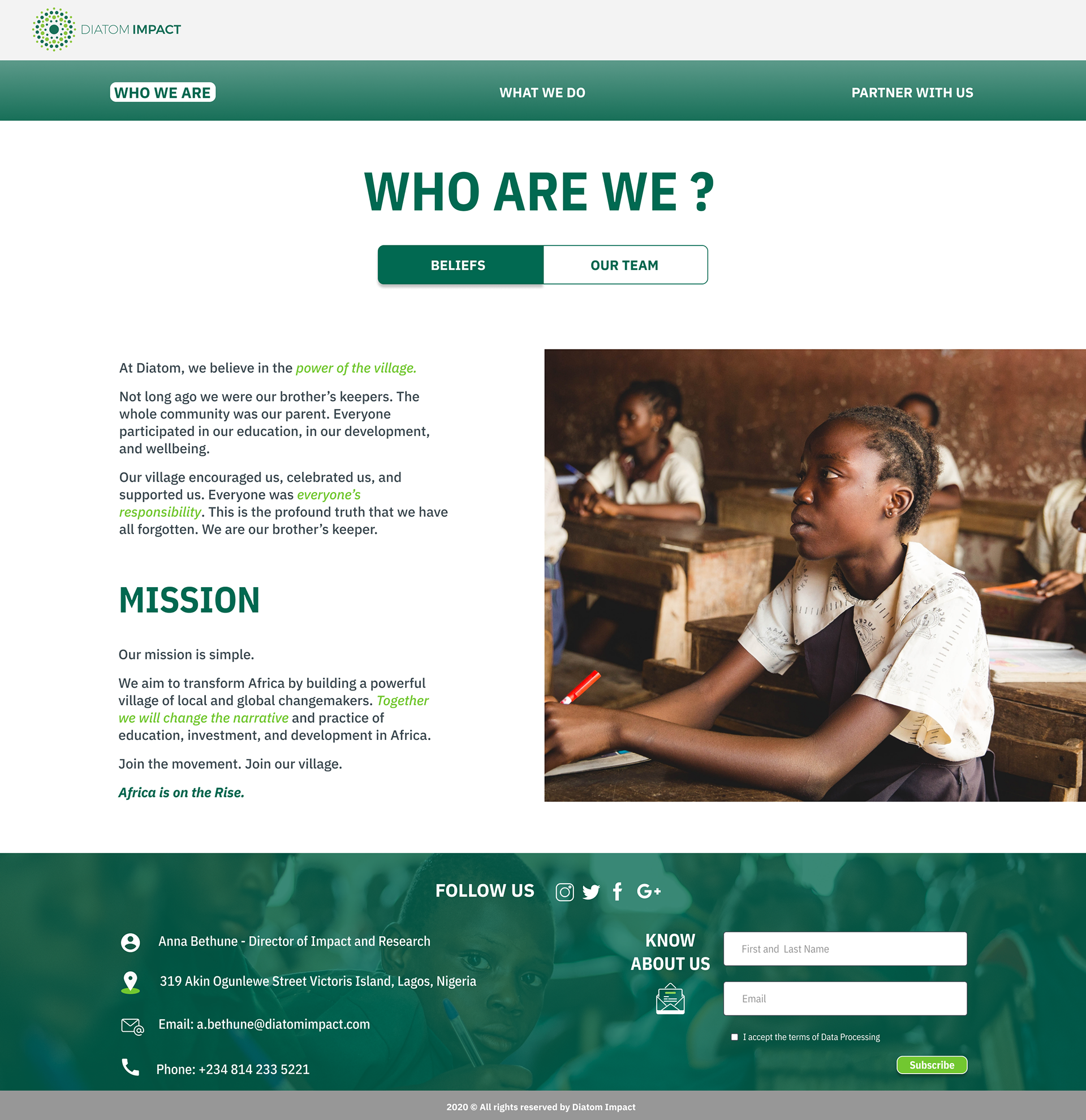
Diatom Impact is a new venture started by Platform Capital Investment Partners, a venture capital firm based in Lagos, Nigeria. It is a non-profit organization with the mission of working at an ecosystem level to improve the everyday lives of Nigerian citizens.
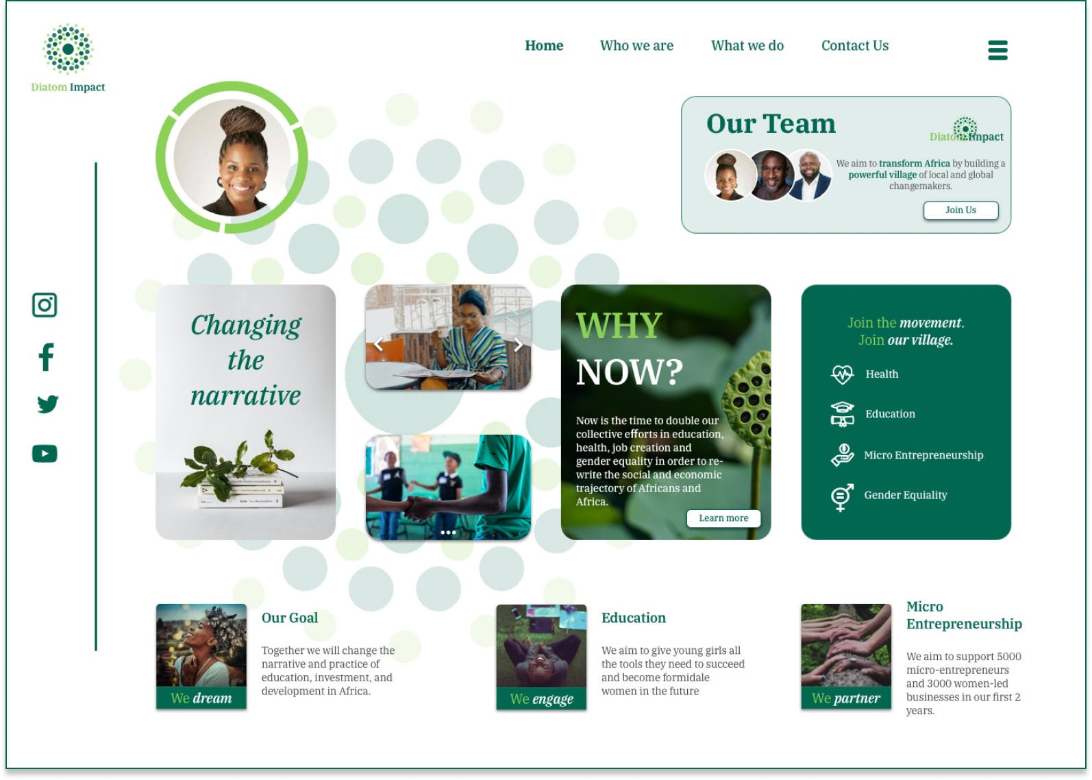
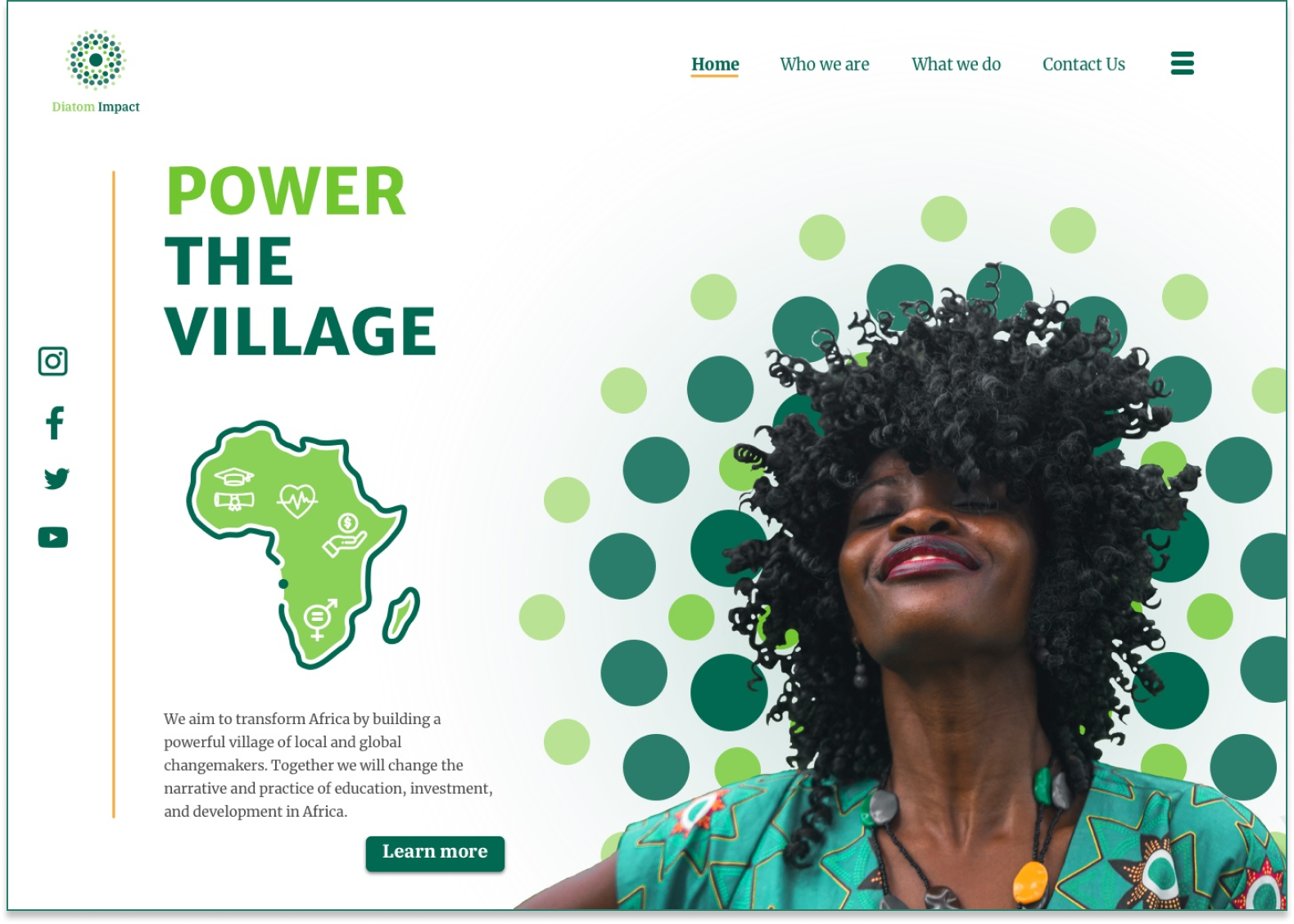
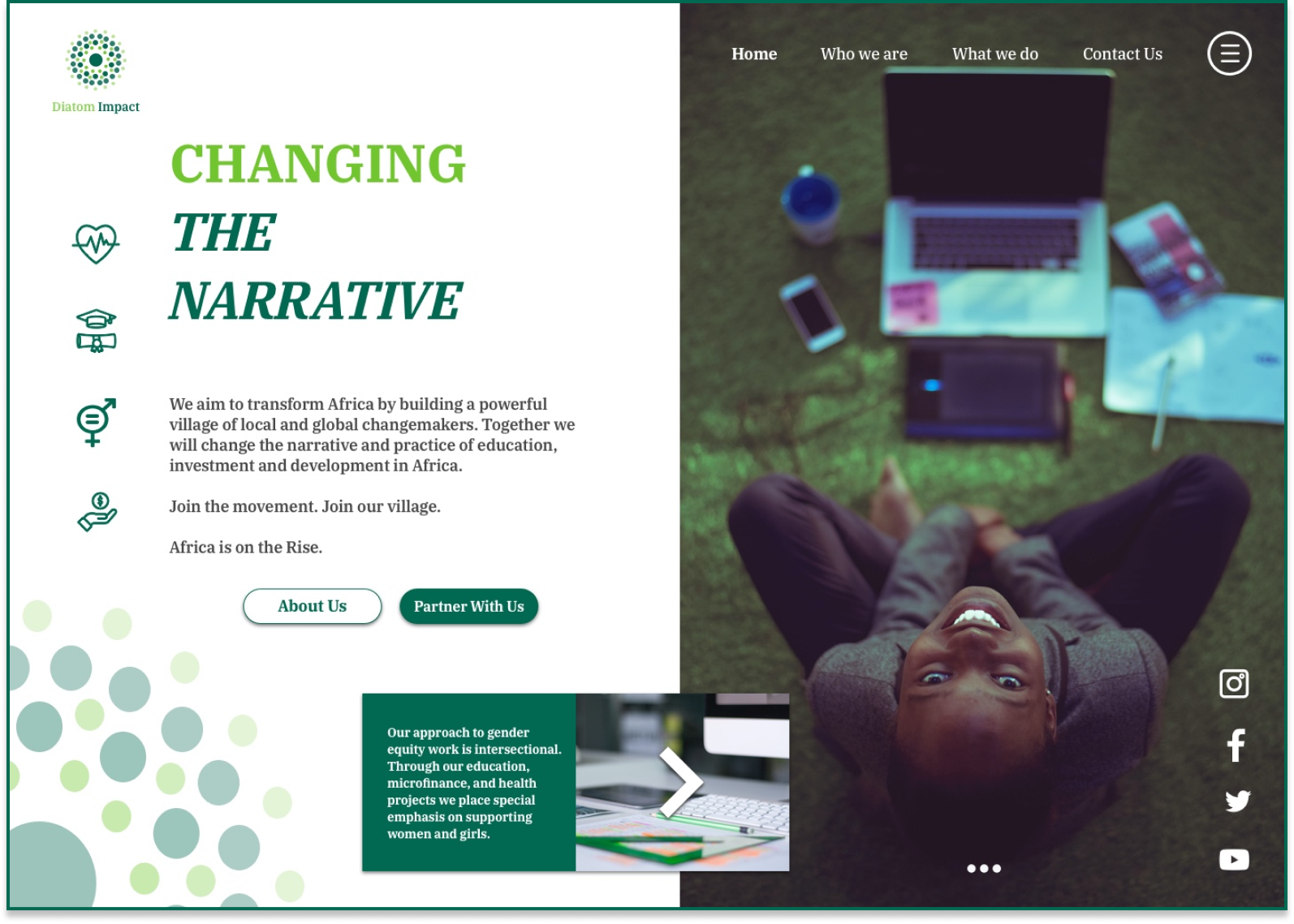
Final Product
As a result of the design process, I was able to delivered my final designs to my client who happily approved my designs
The Challenge
This project will focus on the creation and application of a UI treatment for the front end of the website so that Diatom impact can partner and engage with multi-national and international organizations to fund social impact projects in partnership with local leaders.
The Problem
Diatom Impact needs help in creating and applying a visual treatment that communicates professionalism, integrity, trust, and social responsibility because Nigeria has a stereotype of being full of scammers; this stereotype needs to be overcome, They want to partner with Foundations/CSRs to be persuaded to invest in Africa (and Nigeria specifically).
Design Process
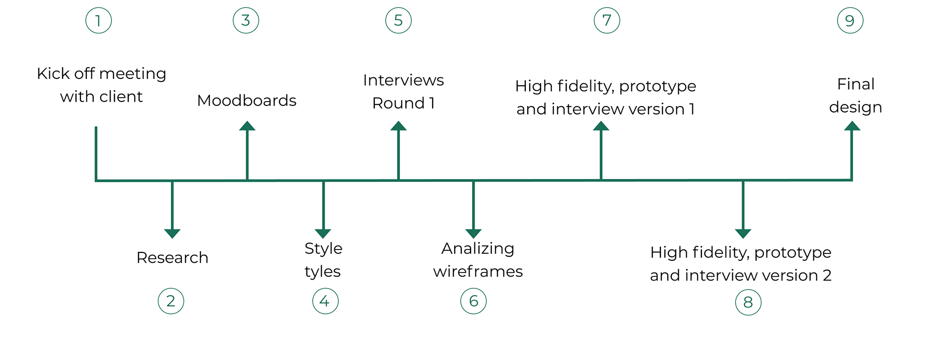
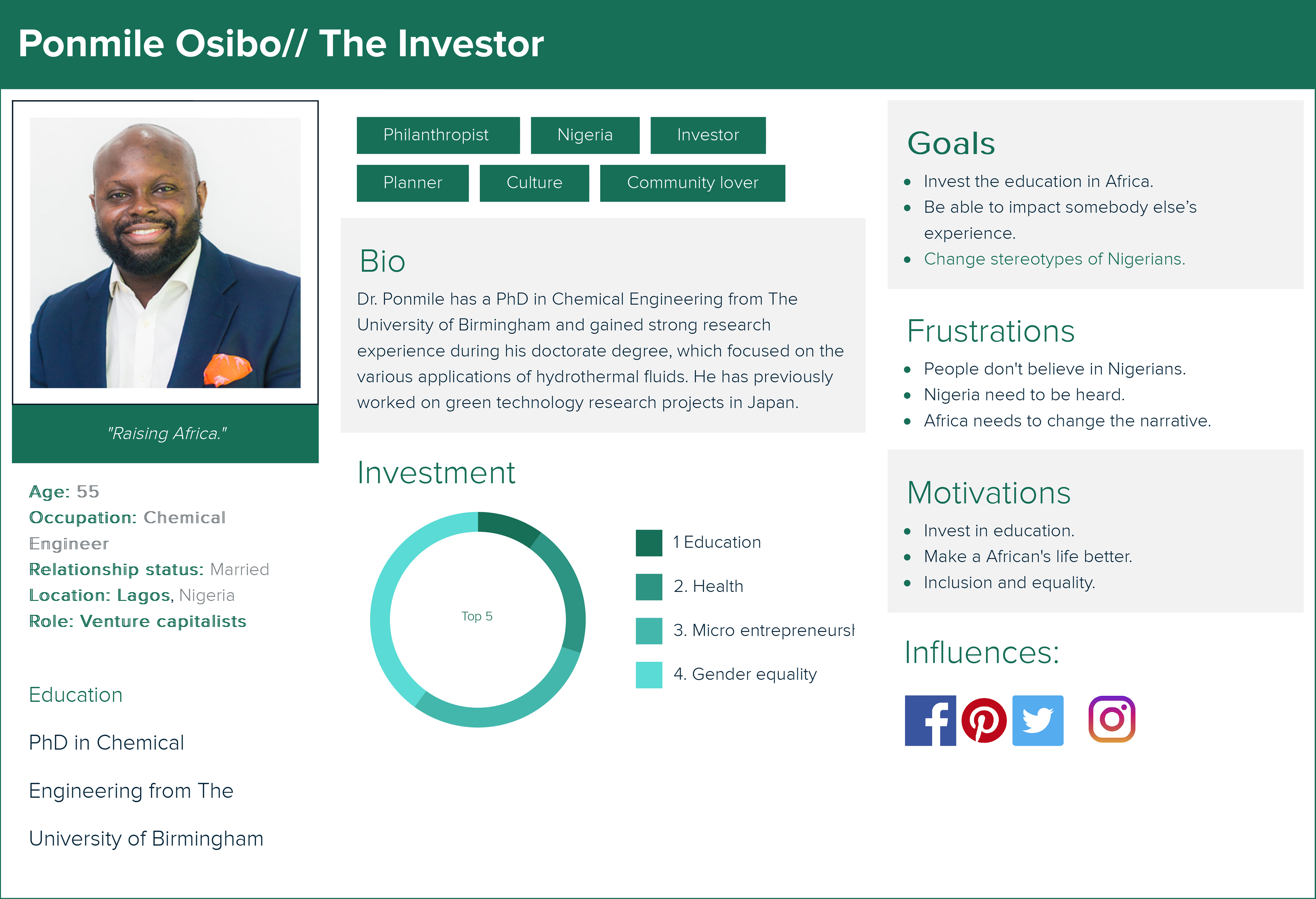
1. Kickoff meeting with the client and proto-persona
The first meeting was crucial in our initial part of the process to understand our client’s needs.
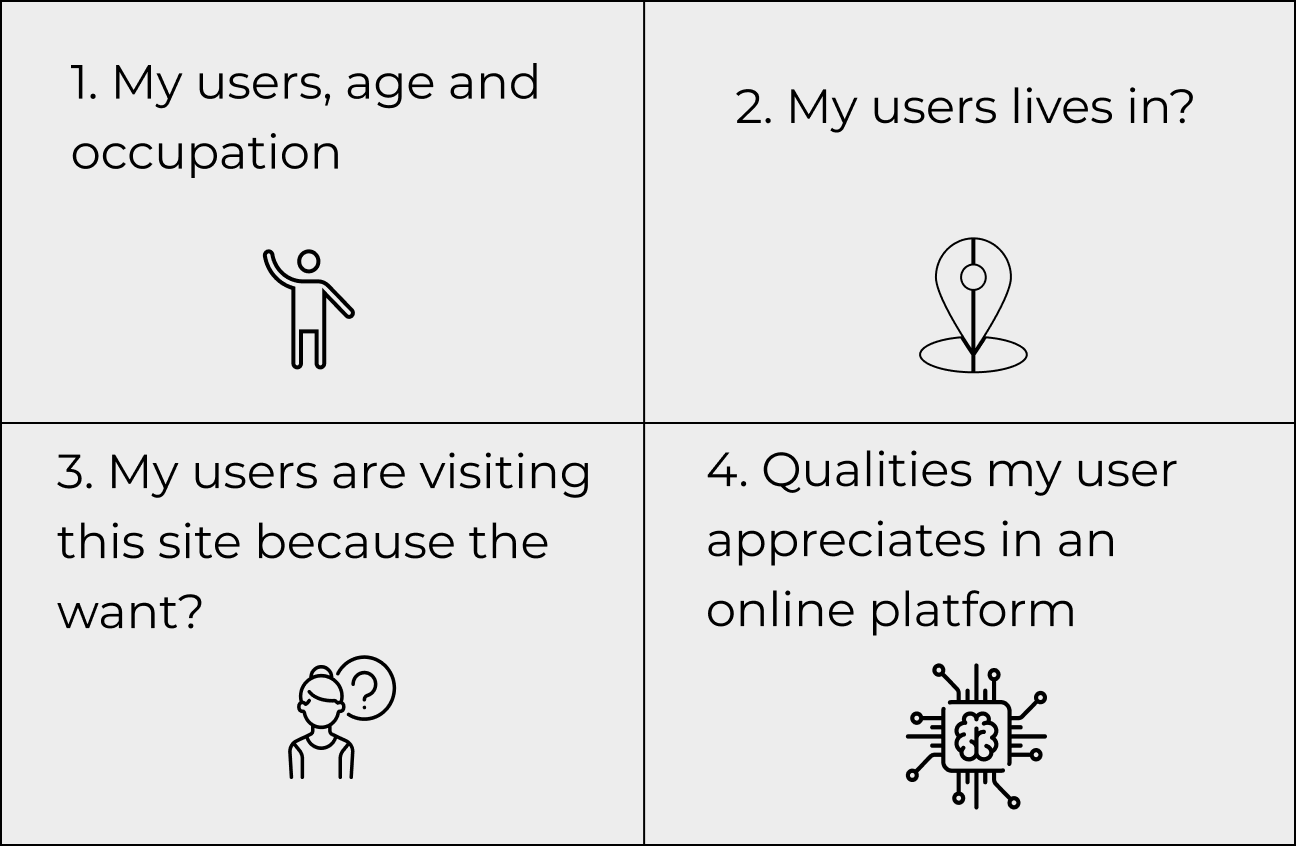
A proto persona is a fictional character generated based on who you think your user is. and then to know about users: behaviors, needs, demographics, and information.
We wanted to make sure we design this site to attract the right users.
A proto persona is a fictional character generated based on who you think your user is. and then to know about users: behaviors, needs, demographics, and information.
We wanted to make sure we design this site to attract the right users.
2. Research
Competitive analysis
Our competitive analysis was focused on organizations who help African citizens and offer different services to the community, the competitive analysis made it was based on visual elements and architecture of their actual websites. (Link here to see the competitive analysis)

Key insights
Keep an eye on where the industry are help us to get deeper insights into competitors’ strategies with expert assessments of their websites. We analyze their technology, visual elements, palette color, UI elements, CTA’s and strategies to disclose trends while delivering relevant developments of interest to you.
The purpose of our competitive analysis was to determine the strengths and weaknesses of the competitors from the visual layout to provide strategies on DIATOM IMPACT website.
The purpose of our competitive analysis was to determine the strengths and weaknesses of the competitors from the visual layout to provide strategies on DIATOM IMPACT website.
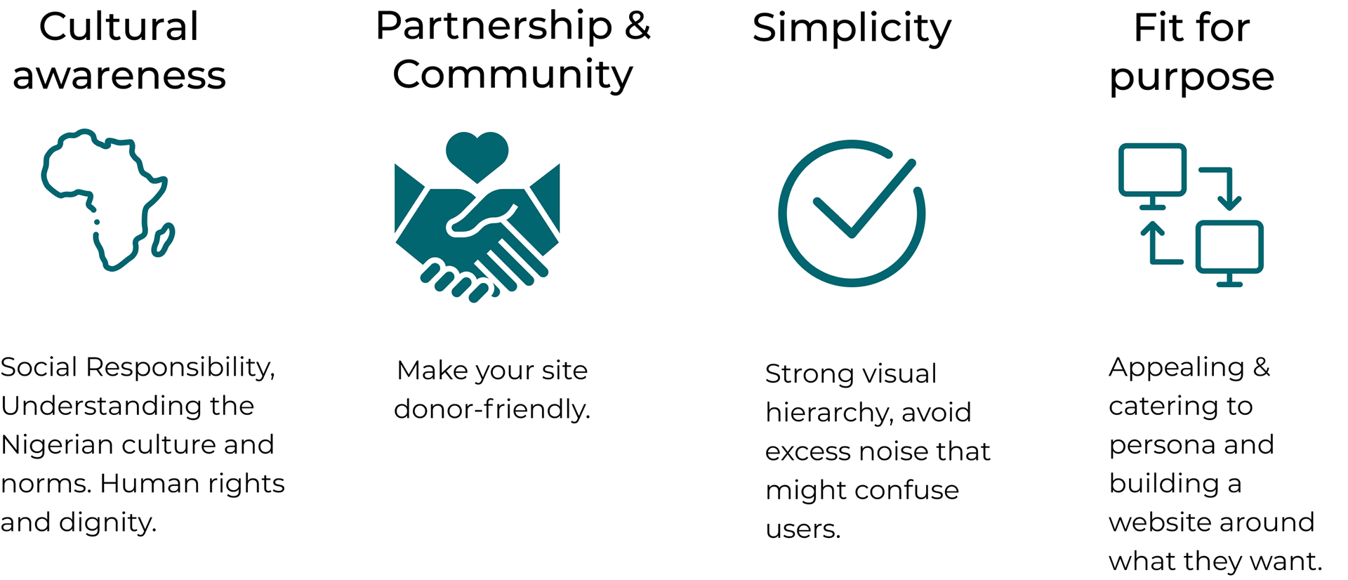
Design Principles
As a team, We discuss different web design principles that will make the website aesthetically pleasing, easy to use, engaging, and effective.
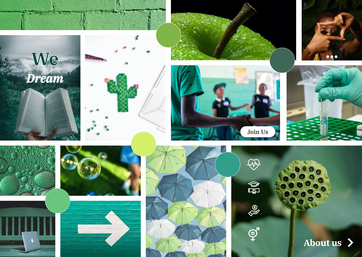
3. Moodboards
Using the proto-persona results and the competitive analysis insights, we decided to go and design moodboards. We also decided to use the colors of the actual logo give our client a variety of options to choose from and give her the option to choose different elements that she liked from each direction.
MOODBOARD 1
The first direction I decided to go was with a focus on human connection, and the mood conveyed through the moodboard was appropriate for the target audience because it represents education, opportunities inclusion, protection, gender equality. The adjectives for the moodboard represent:
Modern
Natural
Collaborative
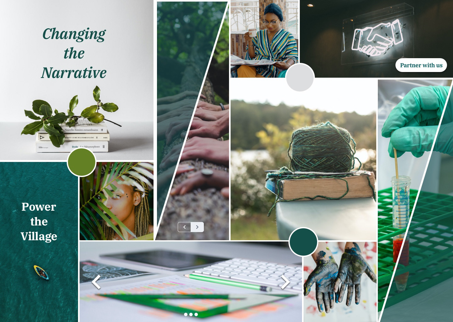
MOODBOARD 2
This moodboard represents teamwork, collaboration, education, equality and inclusion. The adjectives used for this moodboard were:
Professional
Impactful
Reflective

MOODBOARD 3
Represent women in tech, education, health, and freedom of expression.The adjectives used for this moodboard were:
Inviting
Friendly
Optimistic

Final Direction (next step “Style tiles”)
Once the moodboards were presented and approved by the client I had the direction to continue on my style tiles.
The direction choose was based on the layout and feel of the moodboard because represent the main pilar of Diatom Imp[act offering to users the human sense for the goals tha the company is approaching, Also The values preposition included given sense to the mood
4. Style Tiles
Combining fonts, colors, and interface elements helped me to communicate the essence of a visual brand of Diatom Impact. These style Tiles helped me to form a common visual language between me and the client to provide a catalyst for discussions around the preferences and goals of the client.
Style Tile 1
The look and feel of this Style Tile are appropriate for the target audience because represent education, opportunities inclusion, protection, gender equality.
Emotions:
Hope
Kindness
Optimism
Kindness
Optimism
Adjectives:
Modern
Natural
Collaborative
Natural
Collaborative
Style Tile 2
This Style Tile represents freedom of expression, and equality and inclusion and I decided to add the logo as an element to deliver professionalism:
Emotions:
Enthusiasm
Enjoyment
Admiration
Enjoyment
Admiration
Adjectives:
Professional
Impactful
Reflective
Impactful
Reflective
Style Tile 3
Represent women in tech, education. I decided to include the value propositions to make the concept feel more personal.
Emotions:
Inspiration
Confidence
Happiness
Confidence
Happiness
Adjectives:
Inviting
Friendly
Optimistic
Friendly
Optimistic
Final Direction
Once the style tile was presented and approved by the client I had the direction to continue on my process.
The direction choose was based on the layout and feel of the Style because is evoking the main pilar of Diatom Impact offering to users the human sense for the goals that the company is approaching, The values preposition header keep having special place to make sense of what the company is trying to do, CTA’s are giving the option to know better what Diatom Impact offers.

5. Interview Round 1 (styles tiles)
Users find my style Tiles with clear Layout, the Style Tile B was well received and approachable they find the design easy to understand, they love the hero image, good contrast and bold, the use of UI elements ( Icons and CTA’S) could be displayed in a way that users can understand, the headers need to be used in Sans Serif, the body text was readable the Style tile C was found unclear and hard to understand, the information given wasn’t enough for participants, Different styles in one page could be distracted, the hero image is nice, the information displayed was unclear, the contrast and balance between elements are good.
For this round, we interviewed a total of user provided By the client who are associated to:
• Foundations
• CSR departments with interest in international activities
• International development agencies
For this round, we interviewed a total of user provided By the client who are associated to:
• Foundations
• CSR departments with interest in international activities
• International development agencies
6. Analyzing wireframes
Analyzing the wireframes was a key in the process to understand the content that our client wanted to deliver to her users all over the website this analysis help us to understand who Diatom Impact are and the message that wants to bring to potential users,
The challenge of this wireframes was that mostly of the content was text, the architecture of UI elements was missing in big portions of the screens, so that we think to re-do part of the wireframes.
The challenge of this wireframes was that mostly of the content was text, the architecture of UI elements was missing in big portions of the screens, so that we think to re-do part of the wireframes.

7. Hight Fidelity, prototype and interview version 1
At this point, and based on the feedback gathered from the style tiles I determined to follow a single design direction and create hi-fidelity designs of the current product state adding visuals that speak a cohesive design language and add significant value to the user experience
Using the brand colors I incorporate different elements to approach our users with photography, iconography, CTA’s and facts that eventually will inform juicers what Diatom Impact does.


Prototype Round 1
Interview (High fidelity and Prototype )
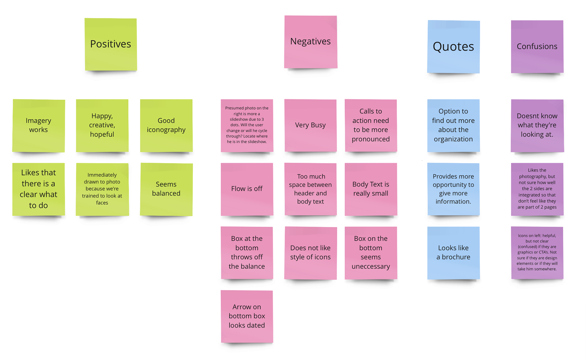
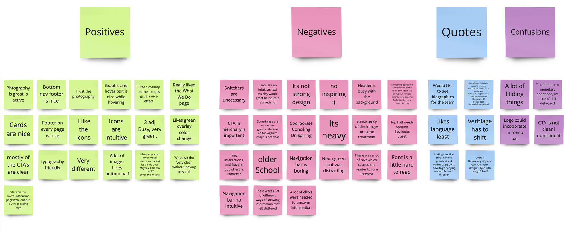
Interviews will give us insights into what users think about a site, an application, a product, or a process. They can point out what site content is memorable, what people feel is important on the site, and what ideas for improvement they may have. For these interviews, we will get feedback from users about our first round of Hi Fidelity Designs.
Top 3 Positives: Photography (treatment and use), icons (intuitive and clear) and CTA’s (clear to now where to go)
Top 3 Opportunities: Heavy, many styles and improve the hierarchy
8. Hight Fidelity, prototype and interview version 2
Now that I’ve gained valuable user insight on my designs, I’ll want to make some research-backed design decisions in the form of iterations. The goal is to further develop and polish my existing designs in a way that establishes the visual aesthetic of the Diatom Impact. Each design decision and iteration was supported by solid reasoning, best practices, testing insights and project goals.
For this round of design the main iterations were focused on cleaning the design providing simplicity, Round 1 was overload with microinteraction that hide value information for users, that’s why tje biggest improvements were based on hierarchy, balance and information clearly.
For this round of design the main iterations were focused on cleaning the design providing simplicity, Round 1 was overload with microinteraction that hide value information for users, that’s why tje biggest improvements were based on hierarchy, balance and information clearly.
Prototype Round 2
Interview (High fidelity and Prototype)
Interviews will give us insights into what users think about a site, an application, a product, or a process. They can point out what site content is memorable, what people feel is important on the site, and what ideas for improvement they may have. For these interviews, we will get feedback from users about our first round of Hi Fidelity Designs.
Top 3 Positives:
Photography: Treatment and use, Iconography informative, Clear Calls To Action.

Blockers:
The content keeps being a block on the process because user don't feel convinced to enroll into Diatom Impact, they want to learn more about the organization.
Solution
For the final design I decide to incorporate call the action around the sections to give user the opportunity to learn more about Diatom Impact .
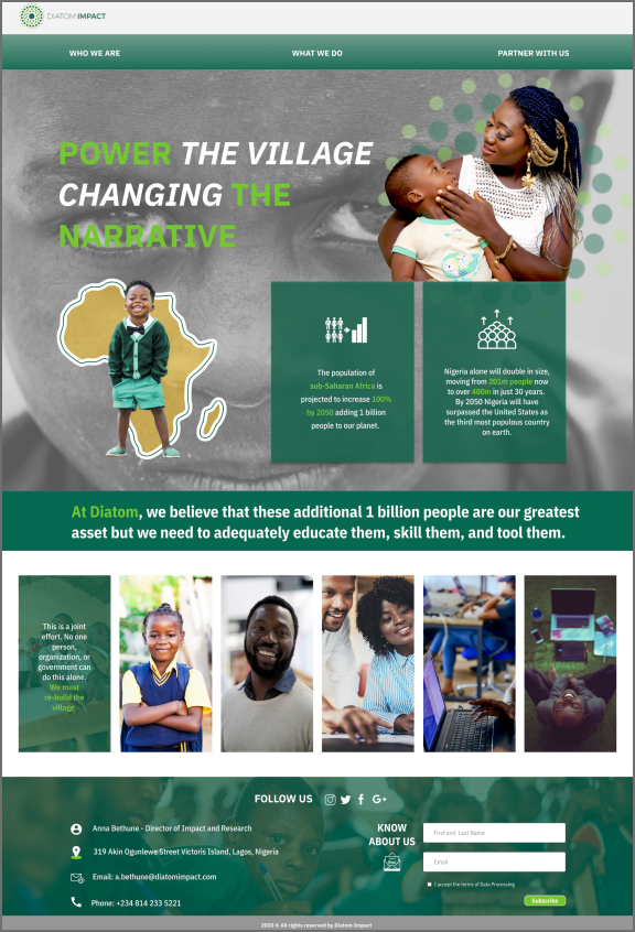
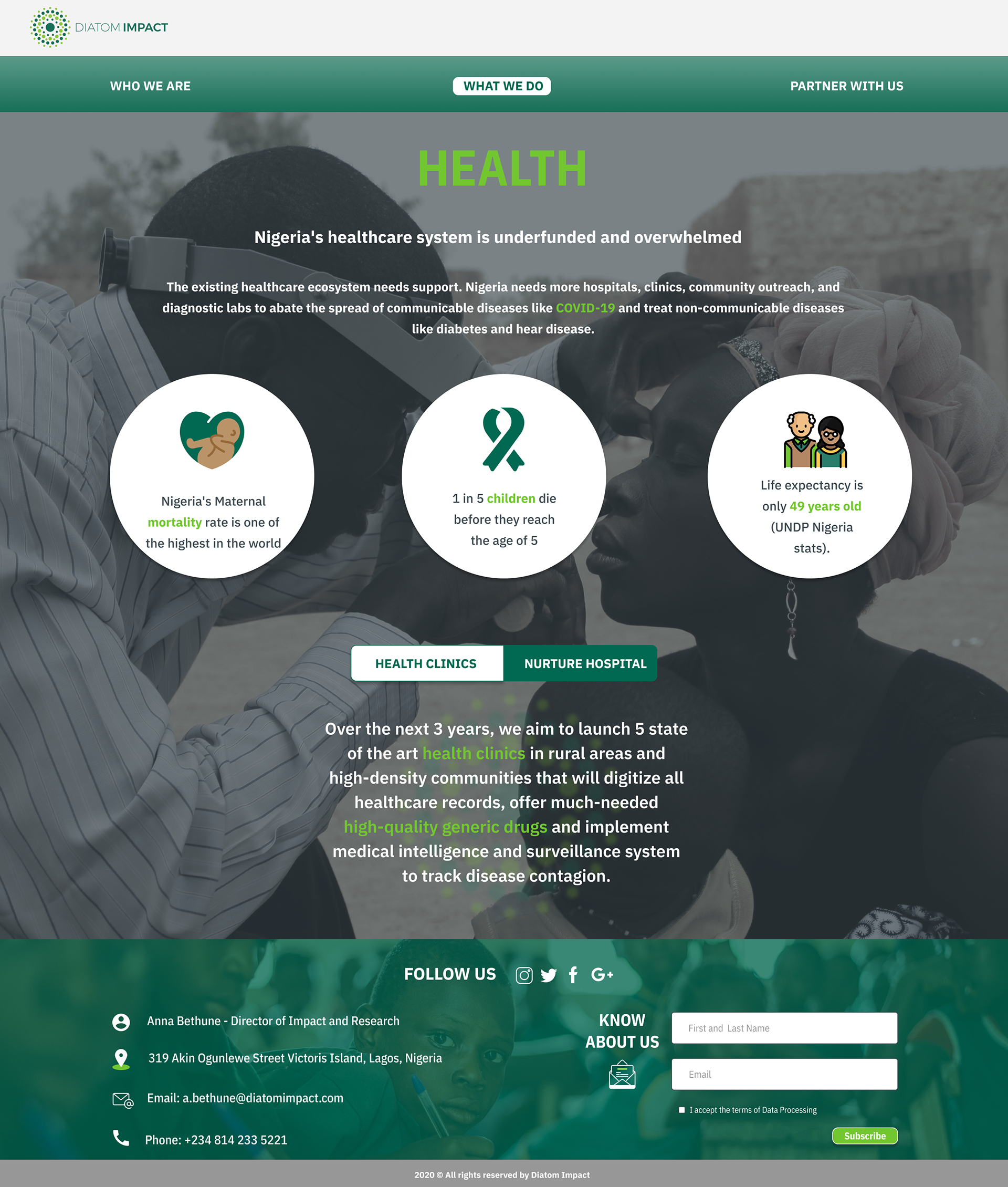
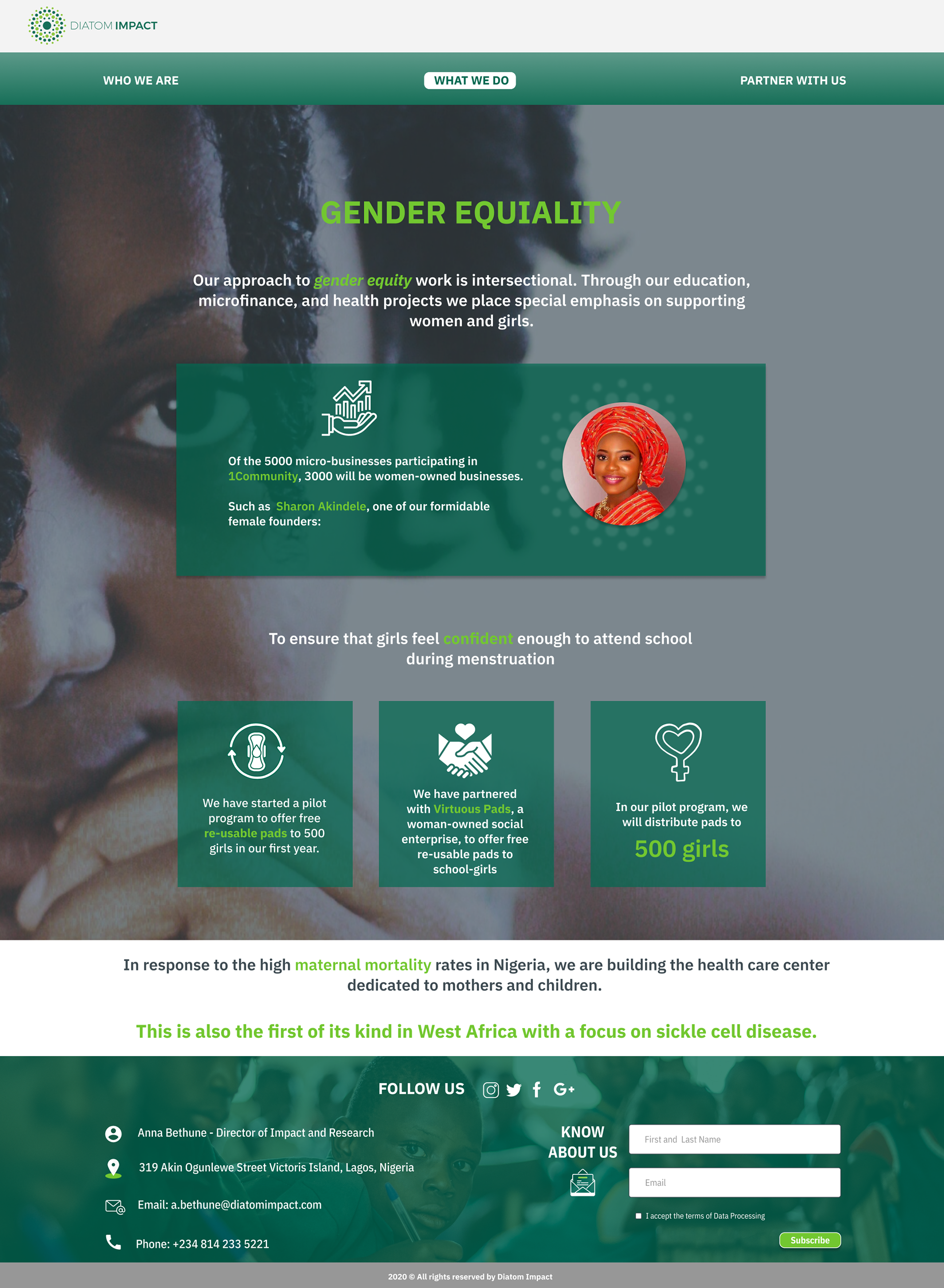
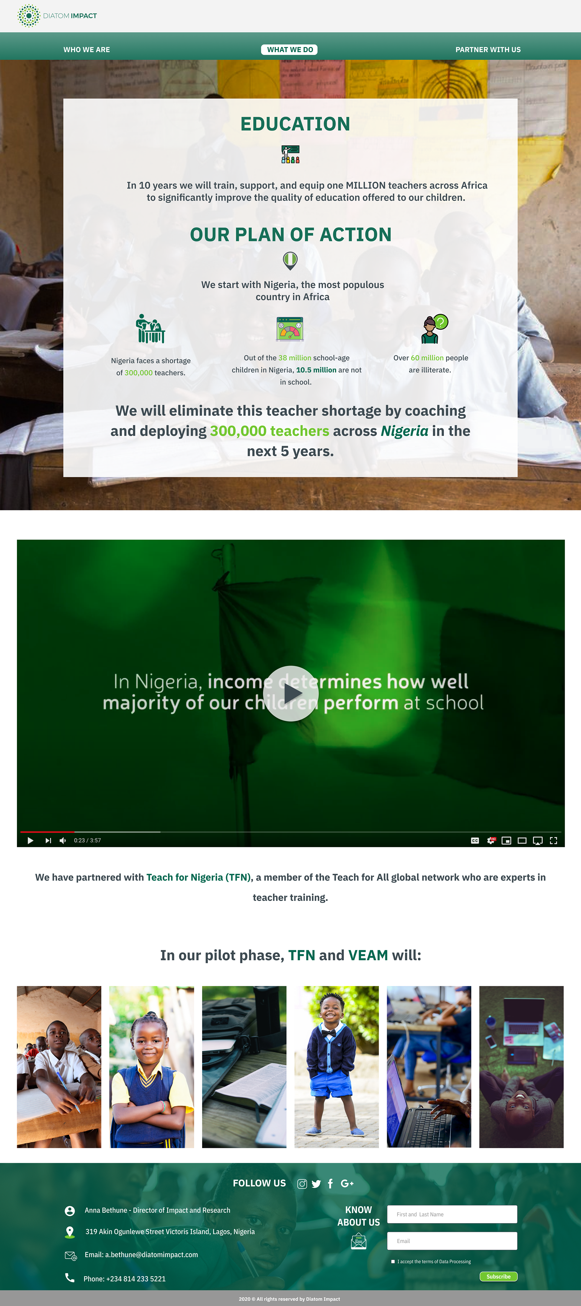
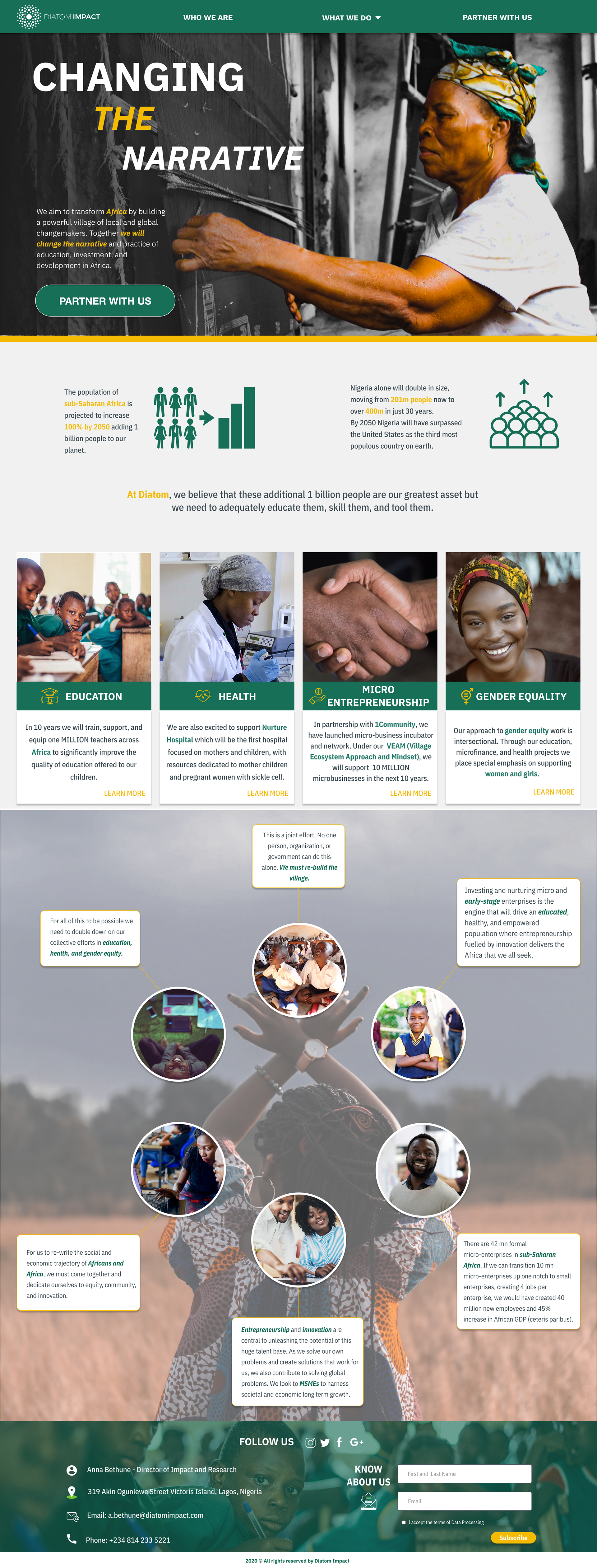
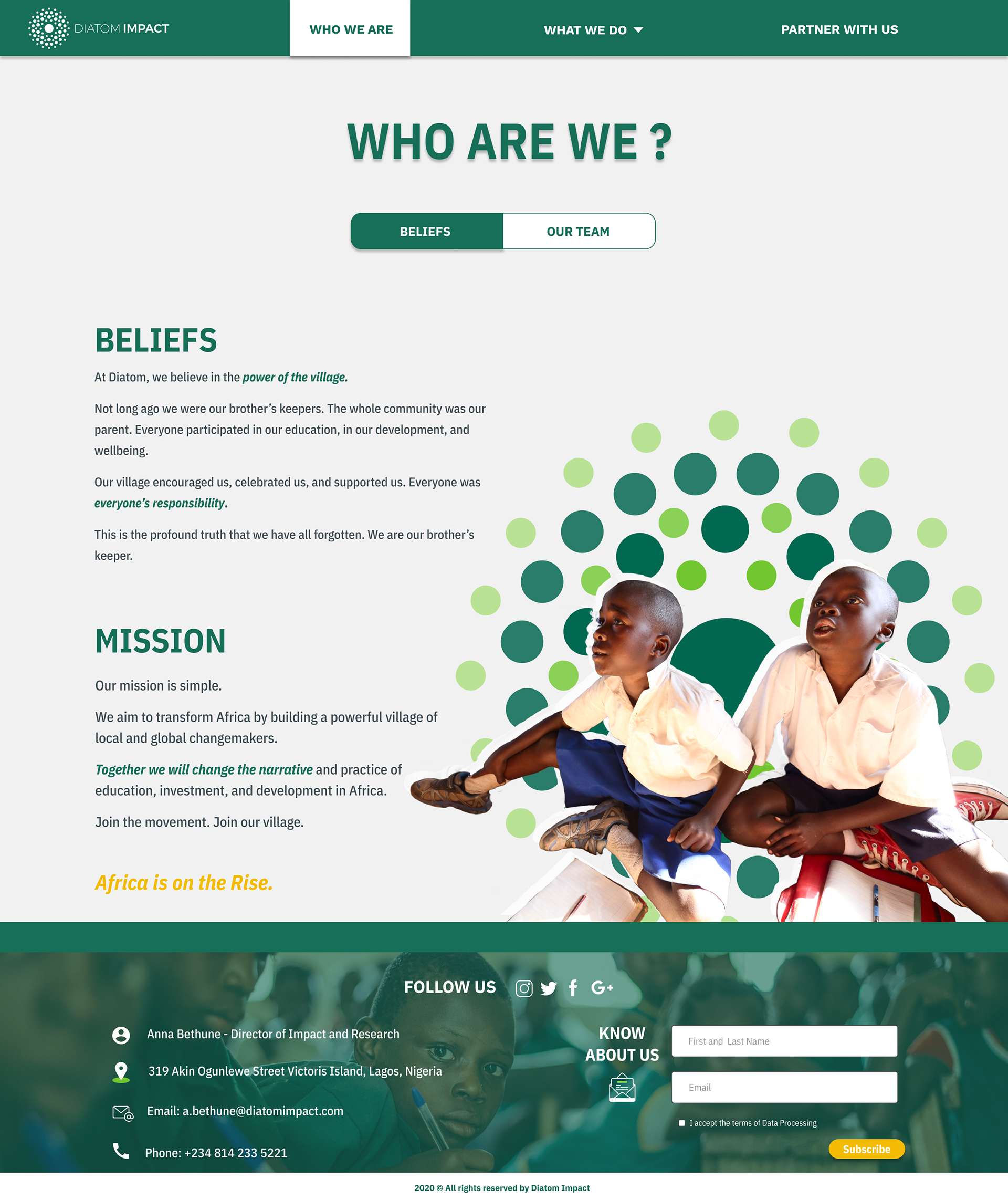
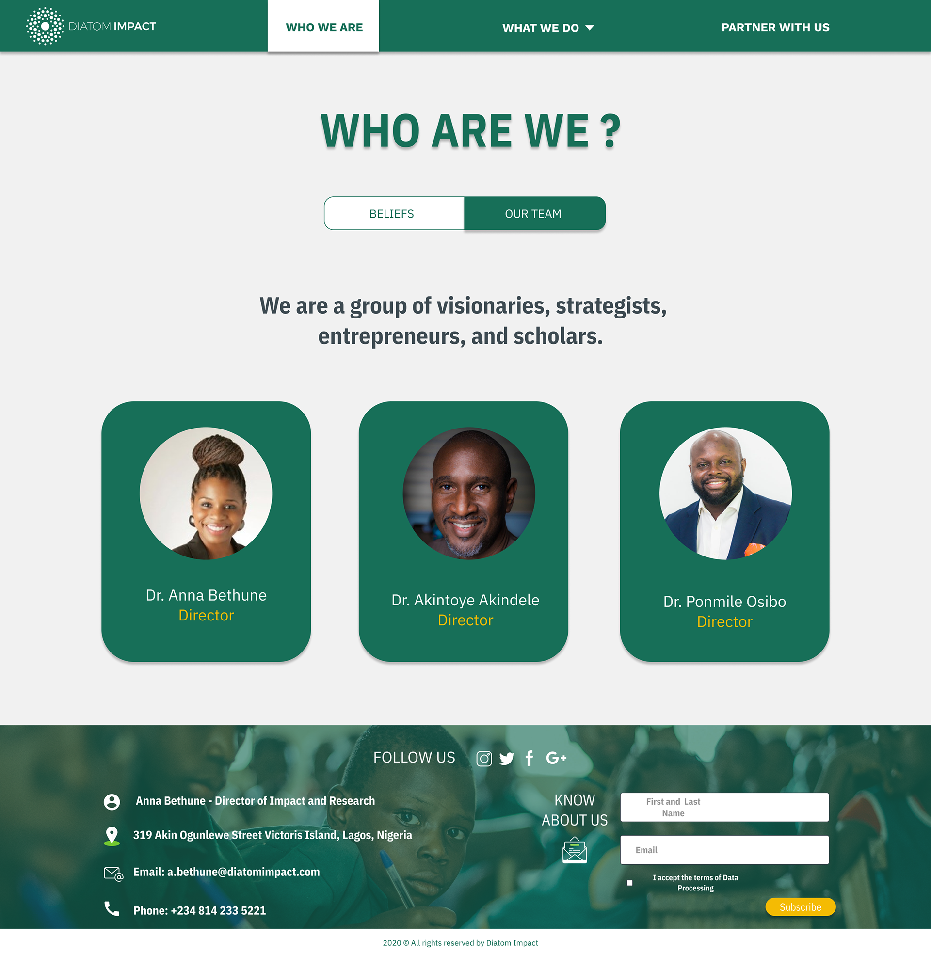
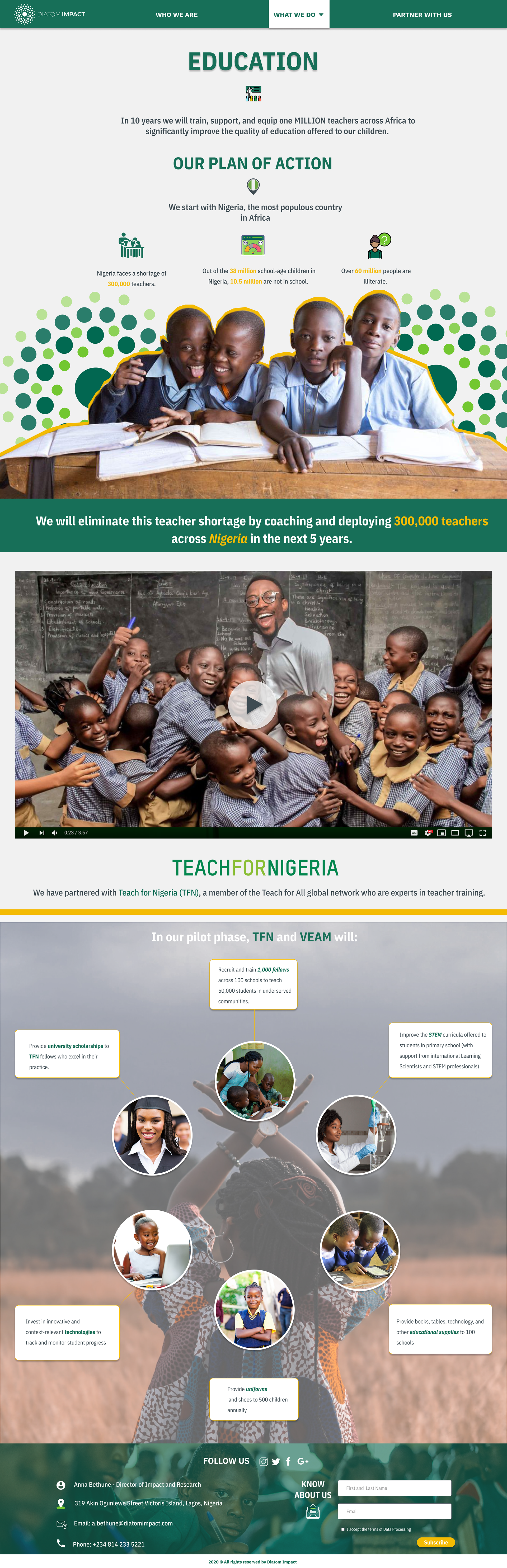
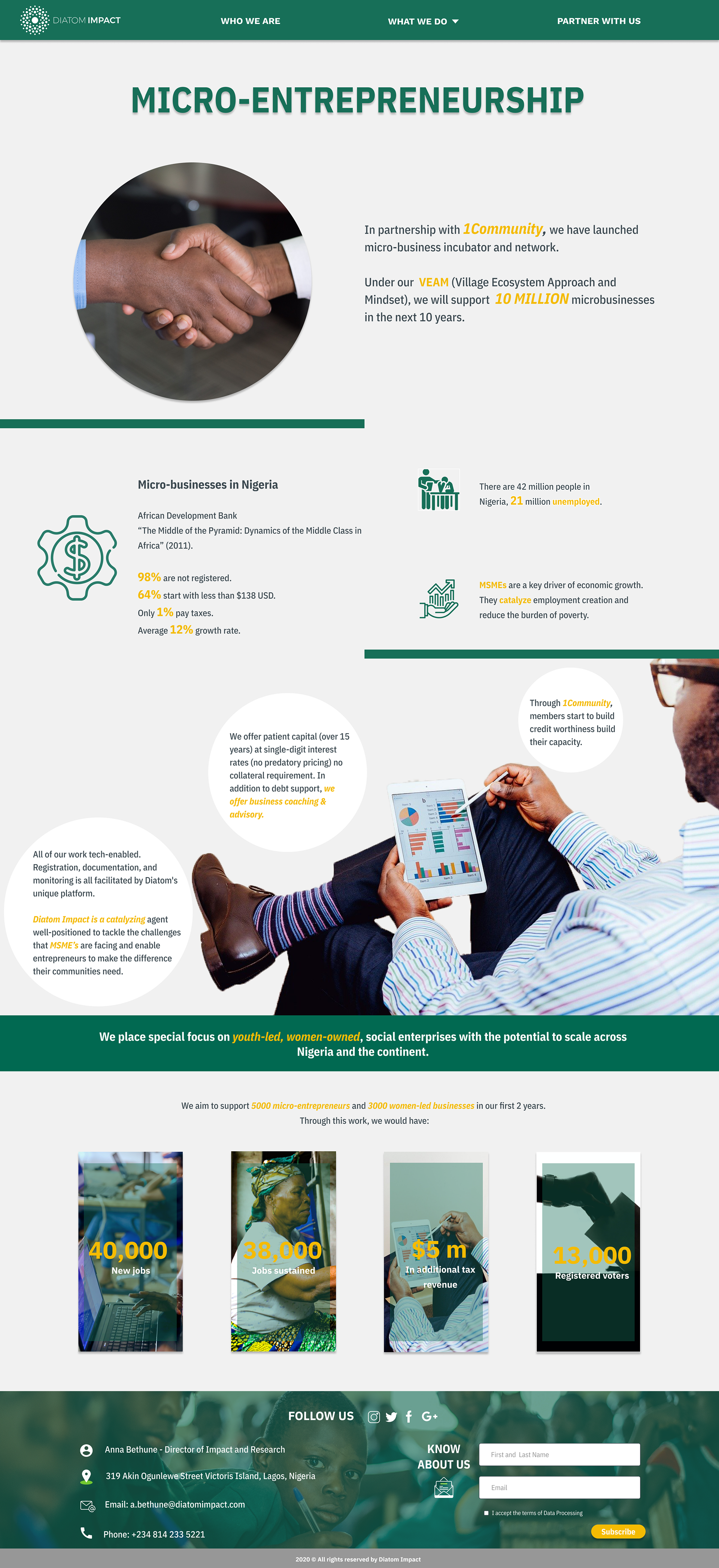
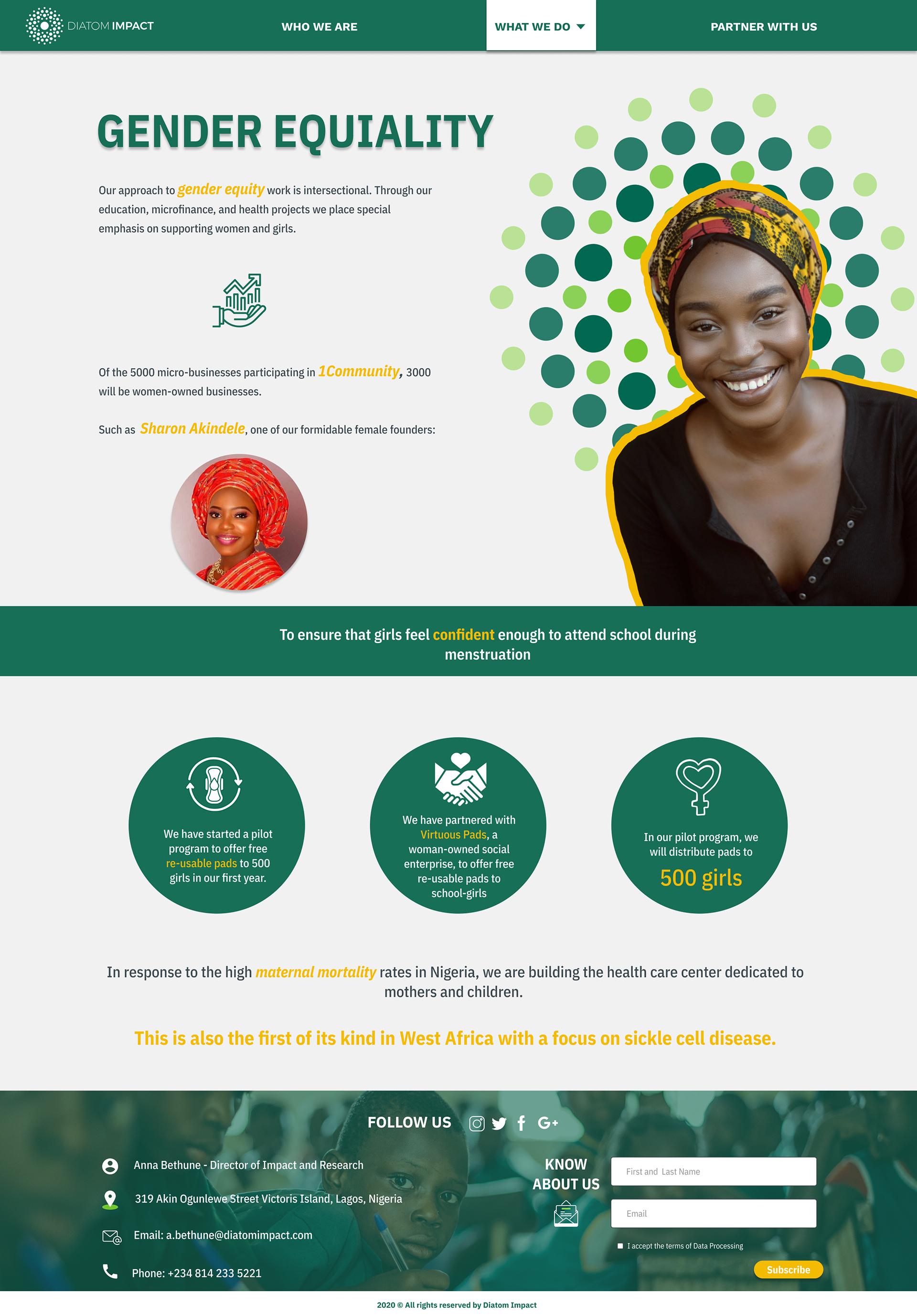
9. Final Design
As a final solution for my design I came up with the idea to incorporate CTA’s around the different sections, in that way users were able to know and explore more about Diatom Impact, specially for the sections “partner with us” this section was one the most confusion for users, because the didn’t know how to Partnert or how to donate, Inlcuding CTA’s allow user to understand and know what Diatom Impact does to help africans.


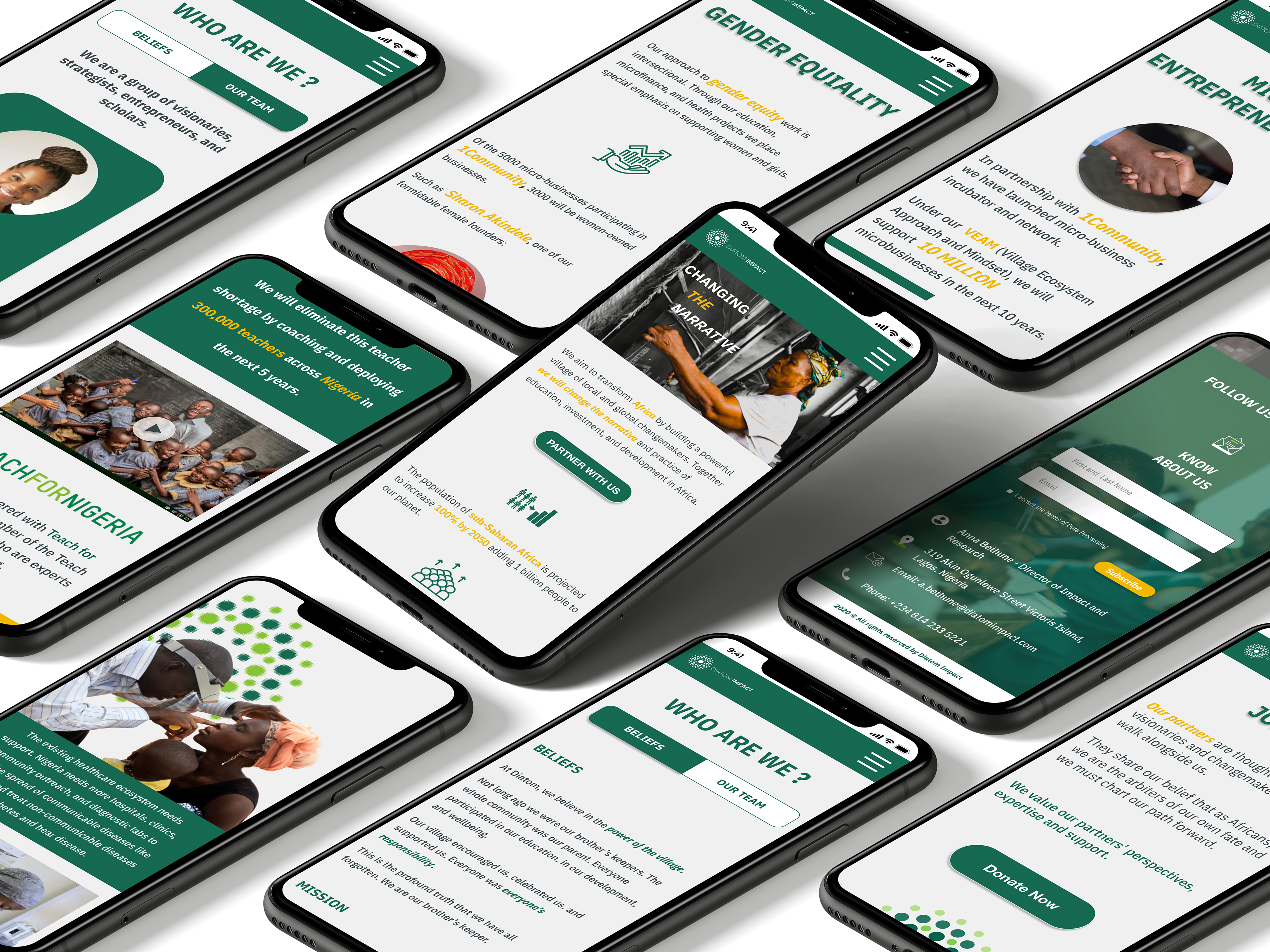
Responsive Design ( Mobile Wireframes)
As a part of the process I've designed the screens for the mobile view, at the beginning of this case study I showed the video with the mobile version here is the wireframes that I've created to show client how the design will look when users navigate through their phones.
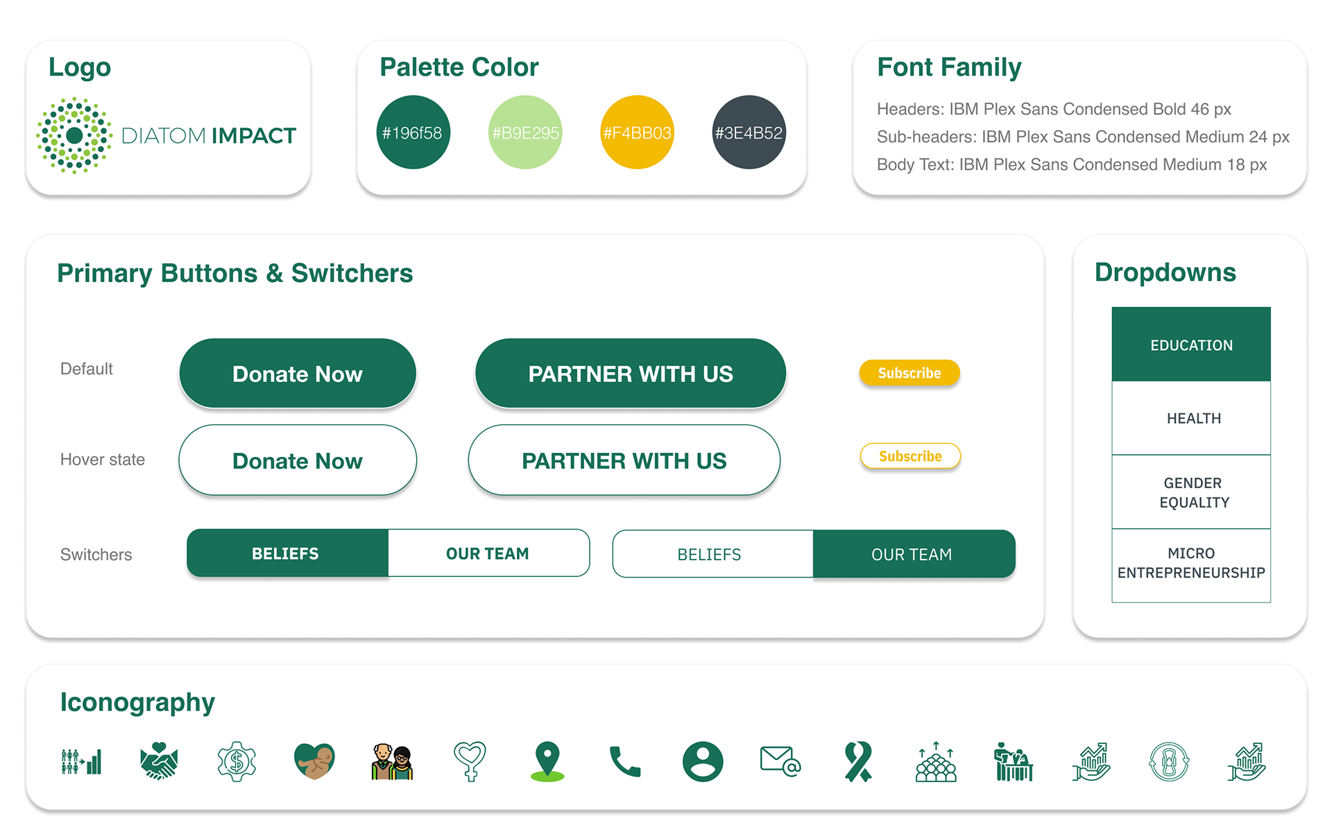
Design System
Conclusion
This project was very valuable to myself and I enjoyed working with a team of individuals to create a product for a Diatom Impact. Our client Anna was an absolute pleasure to work with and was very helpful every step of the way in providing the team with what we required or anything additional that we needed.
It was a great learning experience and our team grew and actively learned together, and from each other. We were also able to effectively adapt to the situations or roadblocks that we experienced in a timely and collaborative manner. We worked extremely well as a team and I am very thankful for my team members. I learned a lot from them and from Flatiron School in general through this project, especially the instructors.
THANK YOU FOR WATCH :)