
PLAYER VS PLAYER
Player Vs player inspires gamer communities by connecting people to interactive events, also Listening to the customers and tuning the product according to their needs.
The Challenge
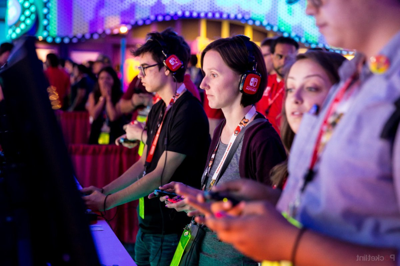
The video gaming industry is a 34-Billion-dollar industry worldwide. Gaming Conventions entice thousands of gamers and spectators to experience, watch and play games, view new technology and watch teams and individuals compete in a variety of game categories for prizes and notoriety.
I will create the desktop application to attract and engage a large audience and also create mobile apps version for users to use while at the actual event.
I will create the desktop application to attract and engage a large audience and also create mobile apps version for users to use while at the actual event.
The Problem
Game Convention Sponsors & exhibitors want patrons to return each year, so the app must be engaging and add to the whole experience. Consider any additional features that will make their visit more enjoyable and stress-free while offering the ultimate event experience for the user.
Target Audience
Player Vs Player inspire and encourage gamers 26-35 years old that enjoy playing various types of digital and online games through unique experiences in our yearly convention with the best exhibitors and best gamers around the world.
Time frame
6 weeks
My Role
I was the UX and UI designer of the project, responsible for both research and high fidelity final deliverables.
Final deliverables
User research, moodboards, style tiles, mid to high fidelity screens & prototype.
Tools:
Sketch & Photoshop
Design process
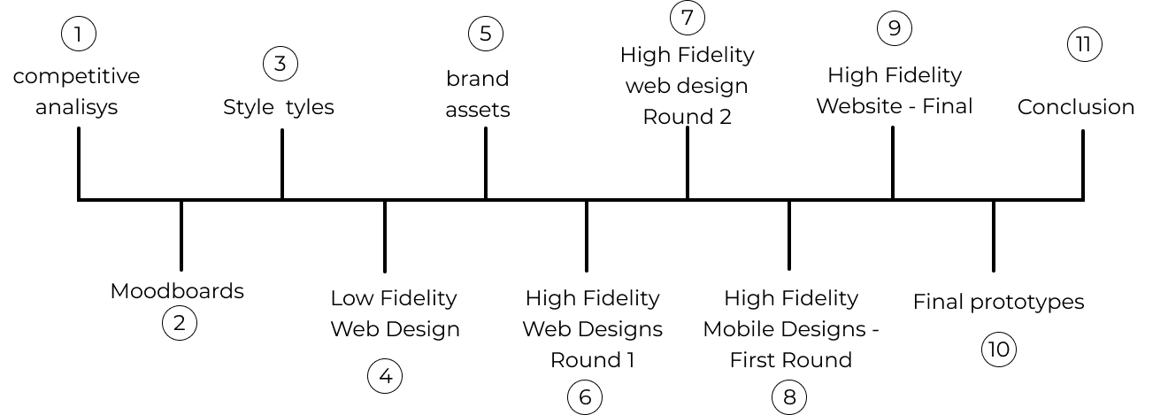
1. Competitive analysis
During the Process I analyzed 4 Web-apps, with this evaluation, I was able to establish what makes the product or service unique, and therefore what attributes we can offer to attract our target audience.

As result of the competitive analysis I was able to gather information about the strengths and weaknesses of the competitor who are leader on the market, using this competitive helped me to understand the market and to be able to came up with solutions on my designs.
Summary


2. Moodboards
Through the next moodboards I wanted communicate my concepts and visual ideas. It is a well thought out and planned arrangement of images, materials, pieces of text, etc. that is intended to evoke or project a particular style or concept.
Moodboard 1
The first direction I decided to go was with a focus on human reto video games, and the mood conveyed through the moodboard was appropriate for the target audience because it represents gamers, controls, consoles, and the colors approach the industry.

Adjectives: Active, Adventurous, Collaborative
Moodboard 2
This moodboard represents E-sports, collaboration, challenge, and excitement.
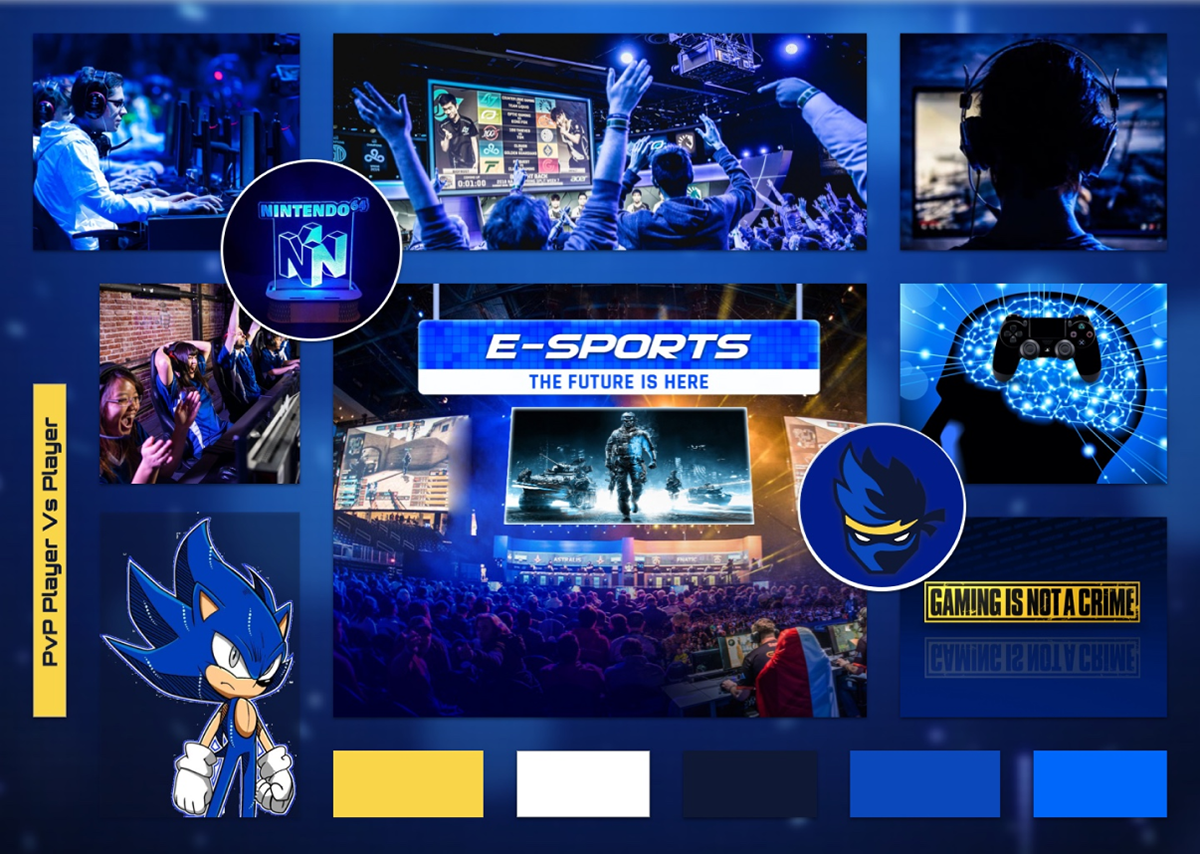
Adjectives: Professional, Impactful, Reflective.
3. Style Tiles
Combining fonts, colors, and interface elements helped me to communicate the essence of a visual brand of Player Vs Player. These style Tiles helped me to form a common visual language to provide a deep feeling around the preferences and goals for the website.
Style Tile 1
The look and feel of this Style Tile are appropriate for the target audience because display different elements to get the user excited about to attend PvP, count down, videos social media , hero image, The colors are active.
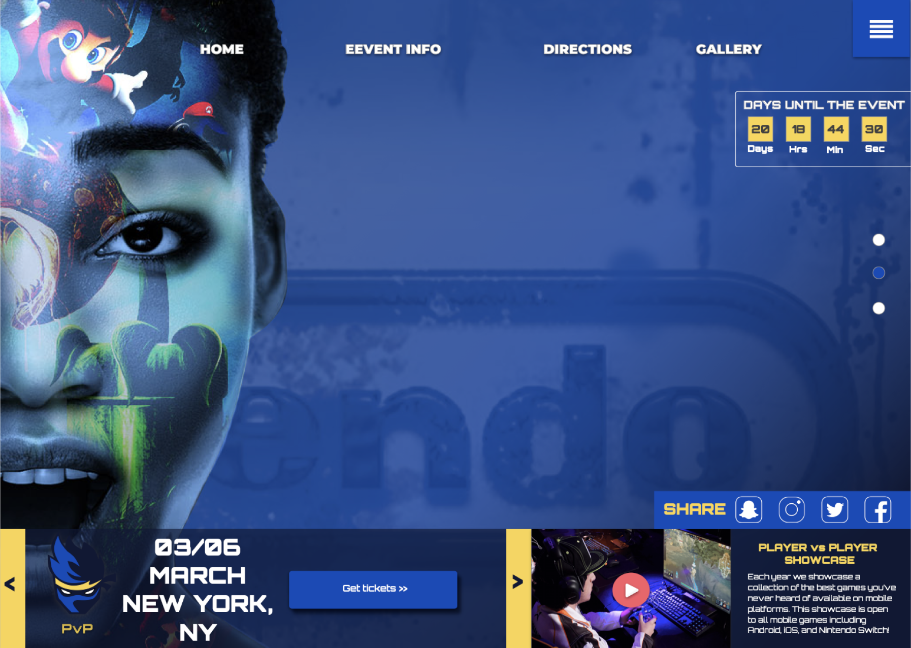
Adjectives: Original, Enjoyable, Official.
Style Tile 2
This Style Tile represents adeventours and the gamer expression, I decided to add the logo as an element to deliver professionalism along with the UI elements
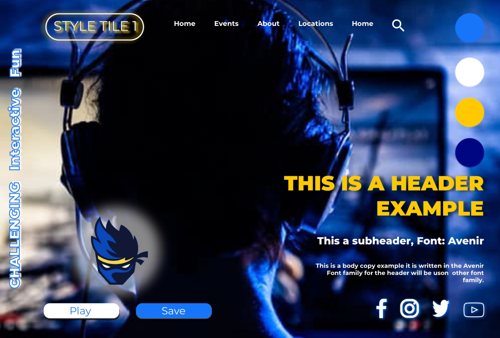
Adjectives: Challenge, Interactive, Fun
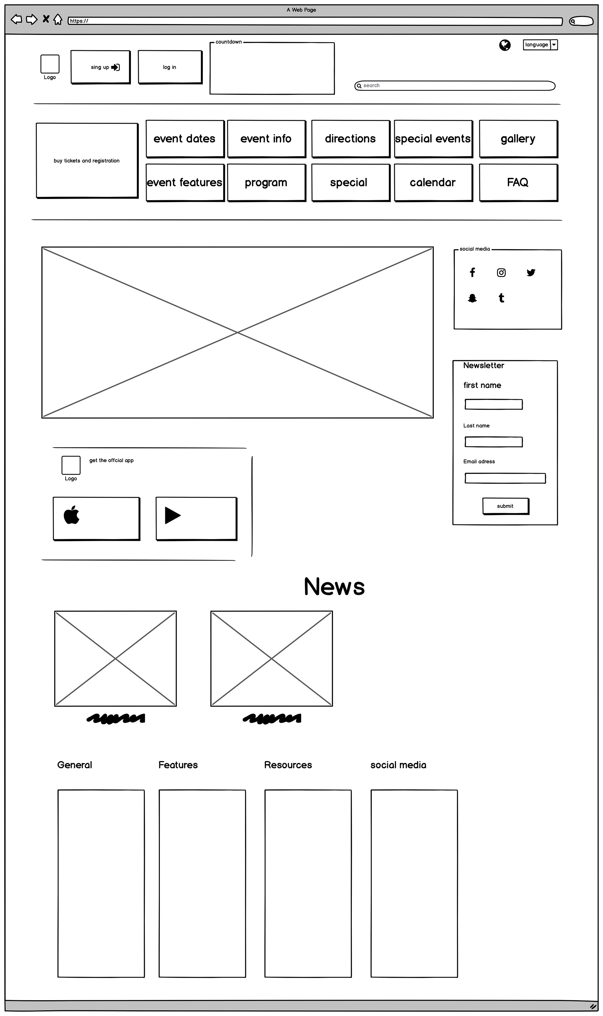
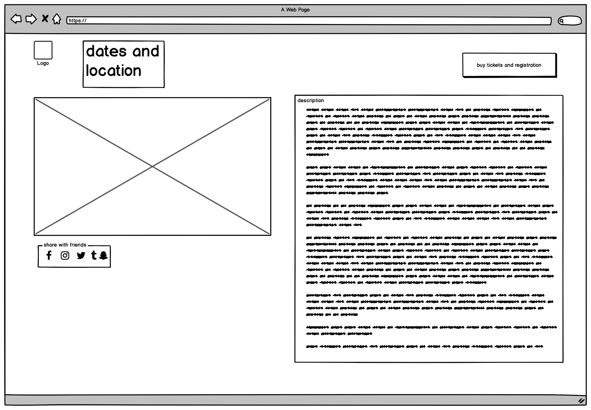
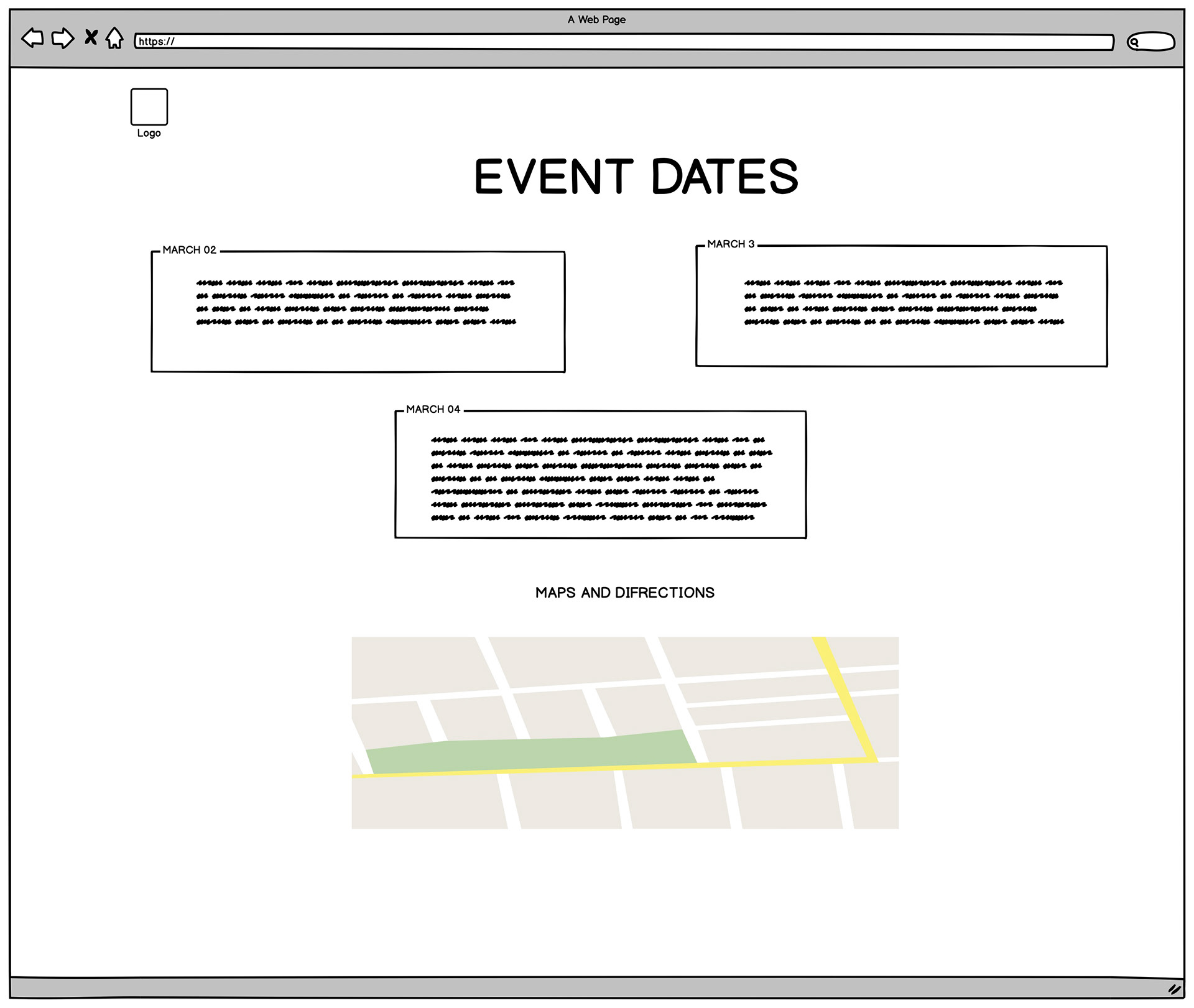
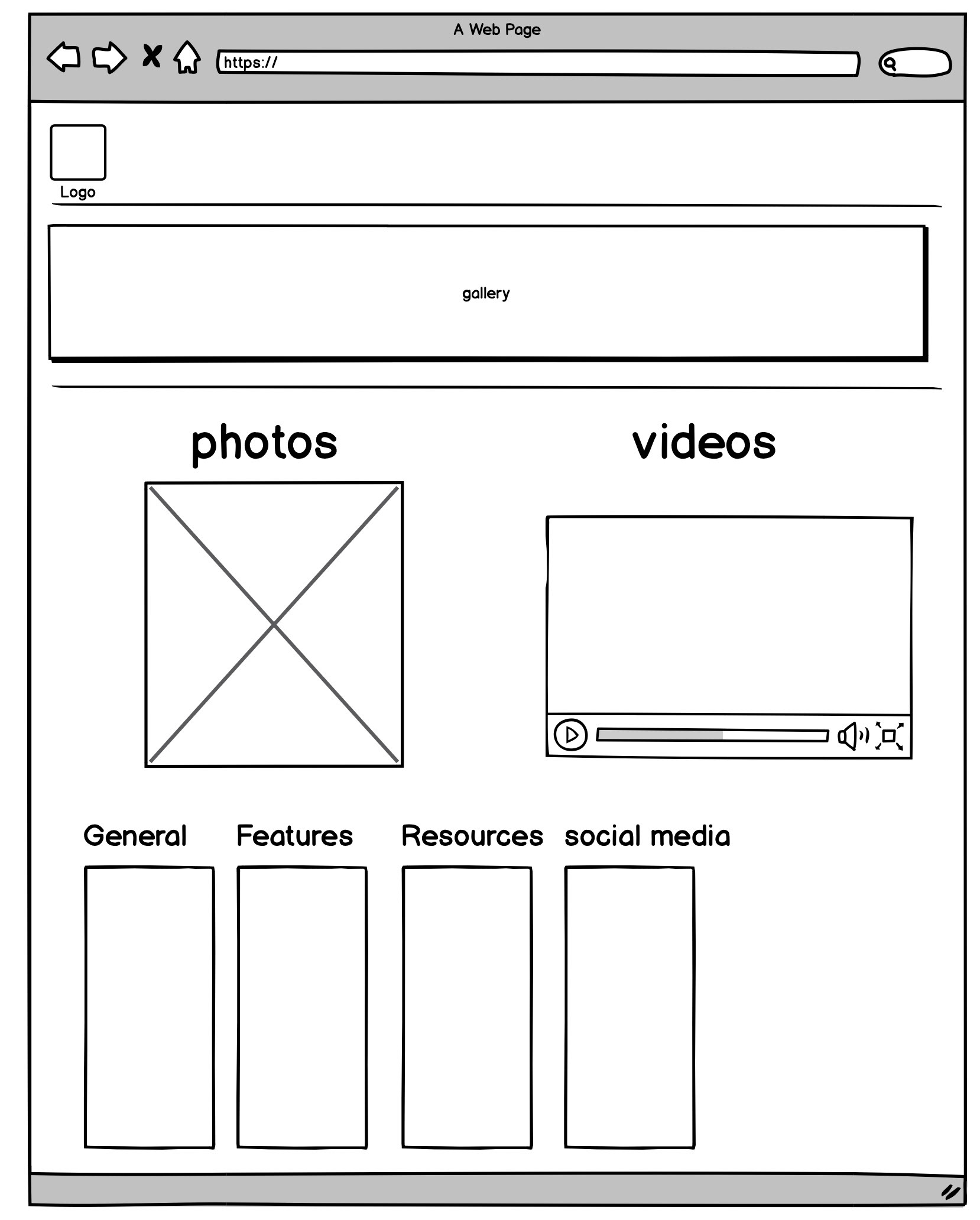
4.Low Fidelity web Design
The next level on my process was Low Fidelity (Wireframe). This wireframes will help to build the shell of the interface, the screens will represent basic infromation architecture.

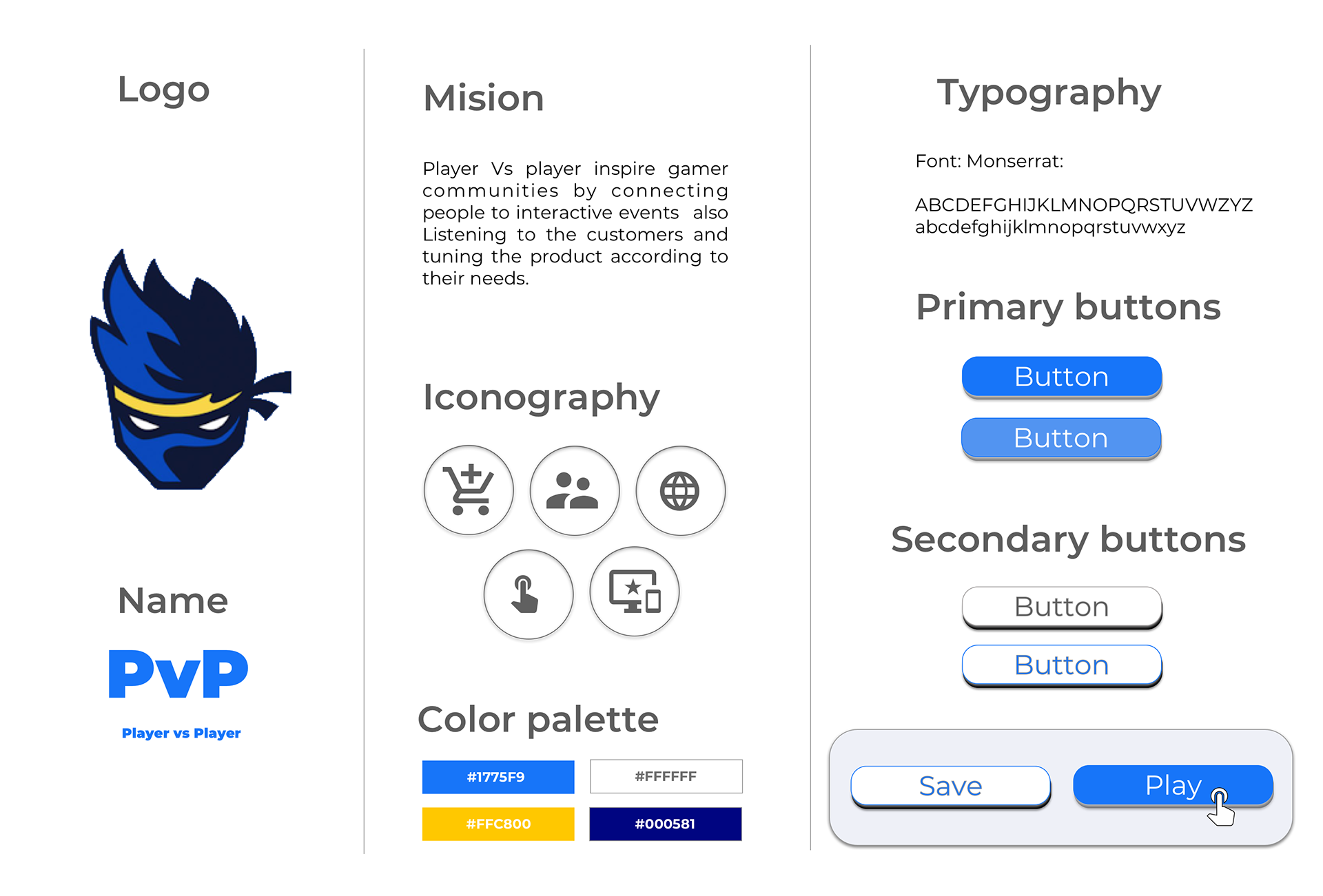
5. Brand assets
Branding assets will bring uniqueness to my brand displaying different UI elements, palette color, visual language that I used on my high fidelity designs
6. High Fidelity web Design Round 1


Feedback and Critique
Getting feedback from peers and instructors was crucial on my process to make future iterations, based on the critique I got opportunities to improve my design, so that I was able to bring a clear design and information for potential users.
Positives
Hero image impactful, Active, Informative.
Opportunities
Busy, Heavy, Hierarchy
7. High Fidelity web Design Round 2

Feedback and Critique
Based on the the feedback I decided to improve the consistency of the elements and the use of the color around the screens, For the second round once again i got possitives and opportunitties for my the final design.
Positives
Hero image impactful, Informative, Interactive
Opportunities
Busy, Hierarchy, Body text tight.
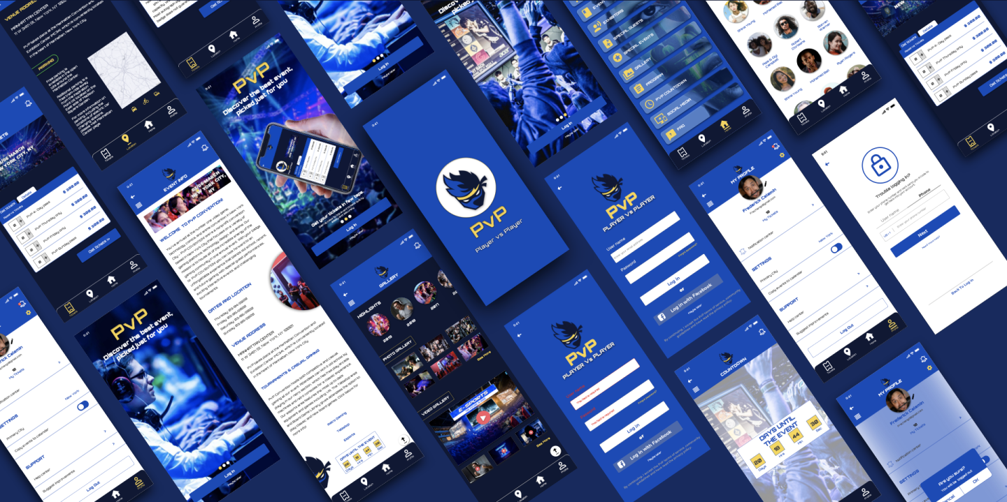
8. High Fidelity Mobile Designs - Round 1
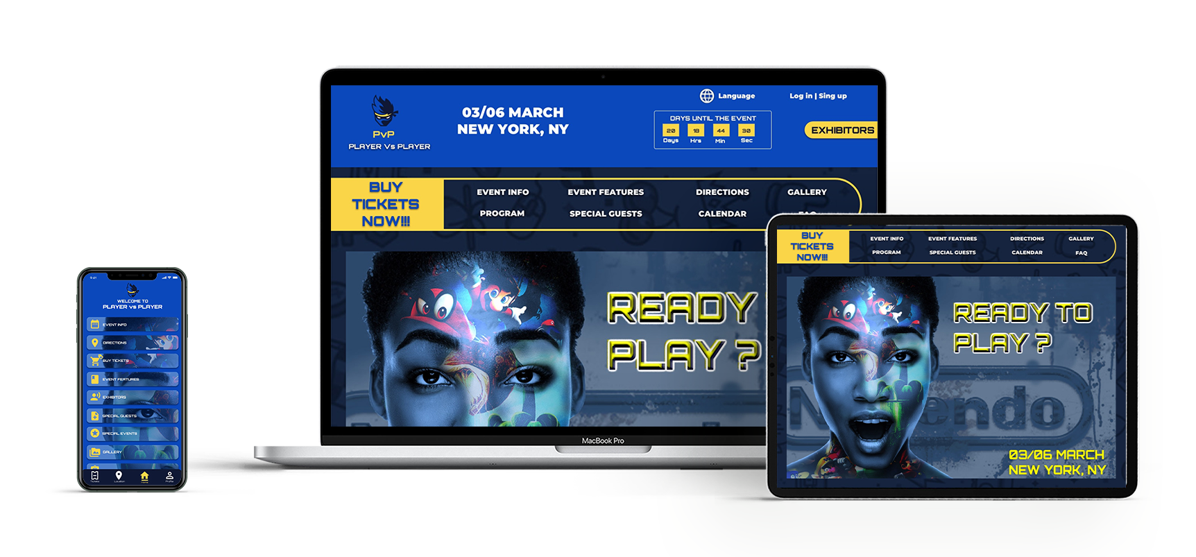
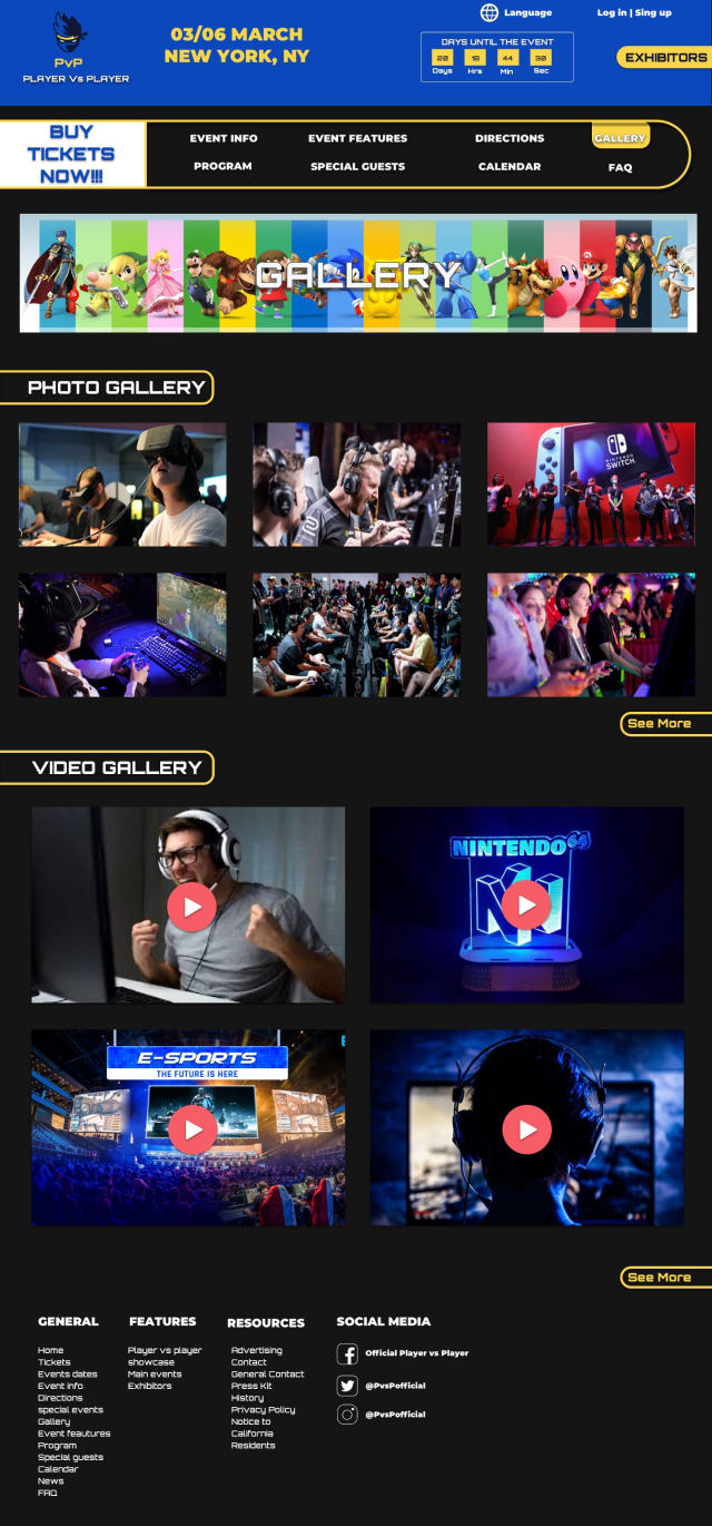
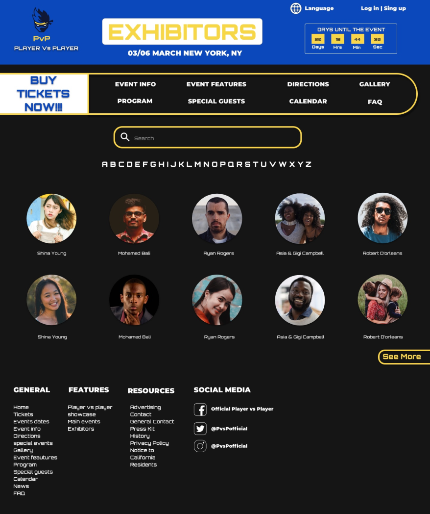
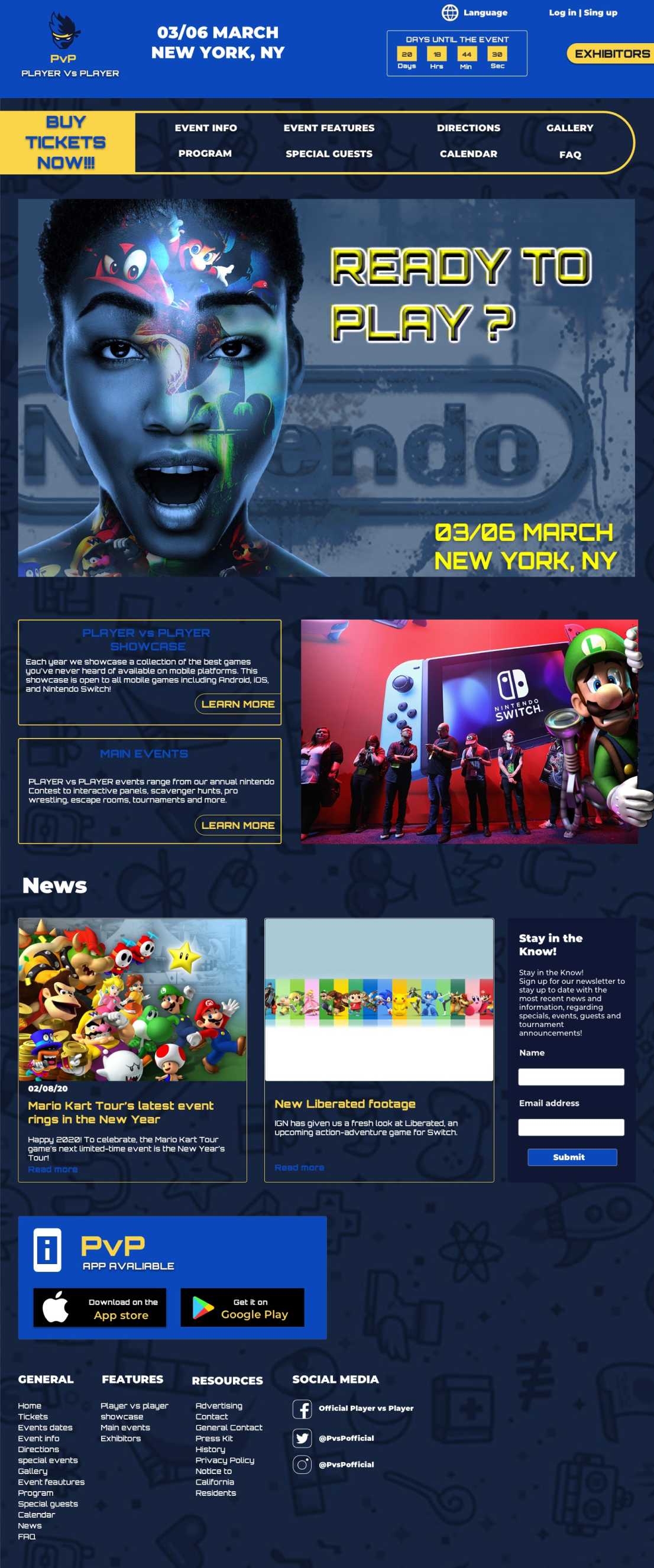
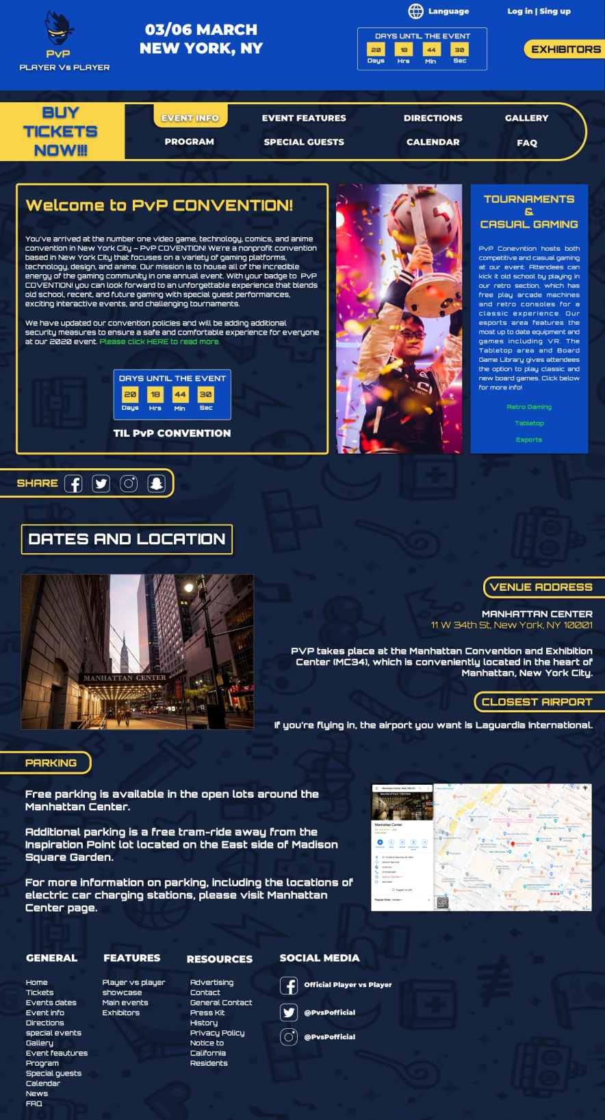
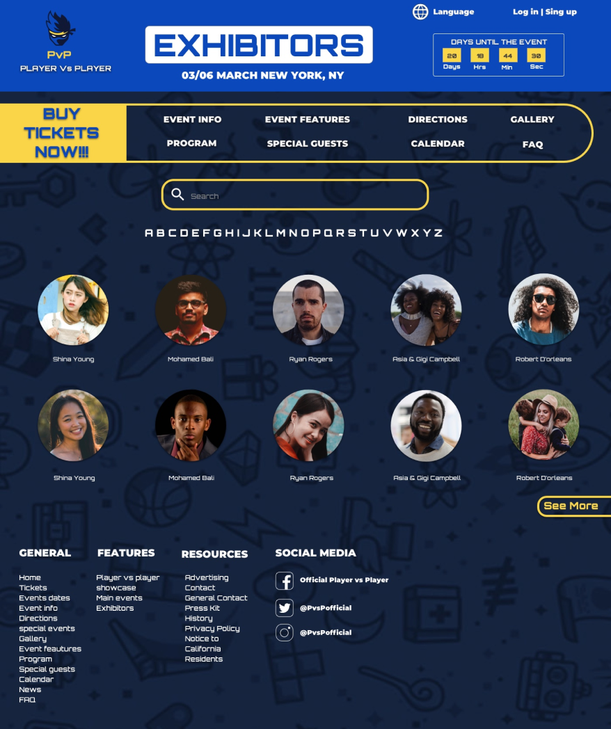
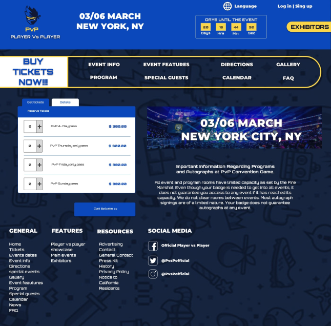
9. High Fidelity web Design - final
Player Vs player inspire gamer communities by connecting people to interactive events also Listening to the customers and tuning the product according to their needs.
10. Final prototype
11. Conclusion
This project was very fun and interesting to work ,I enjoyed working and knowing about the industry of gamers from the professional perpespective and how the industry has grown in the lasta years. It was a great learning experience . I learned a lot building this website/app, especially the instructors.
Thank you for watch :)